Google Launch New Logo
2nd September 2015
15M People Worldwide Can Now Access Web Via Internet.org
28th October 2015Android 6.0 Marshmallow is such a mishmash of features that I spent a long time trying to suss out the unifying principle behind it all. Turns out, the answer was literally right in front of my face the entire time I was looking at my phone: that new, colorful Google logo.
It’s divisive, like any bold rebranding. It gets rid of the childish lettering in favor of a more restrained font — but still has an aura of playfulness in the coloring. It’s a sign that Google’s growing up; it’s more refined and able to put on a suit if need be — but it’s still probably going to wear some kind of novelty joke tie.
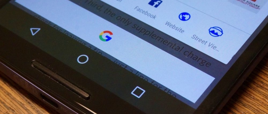
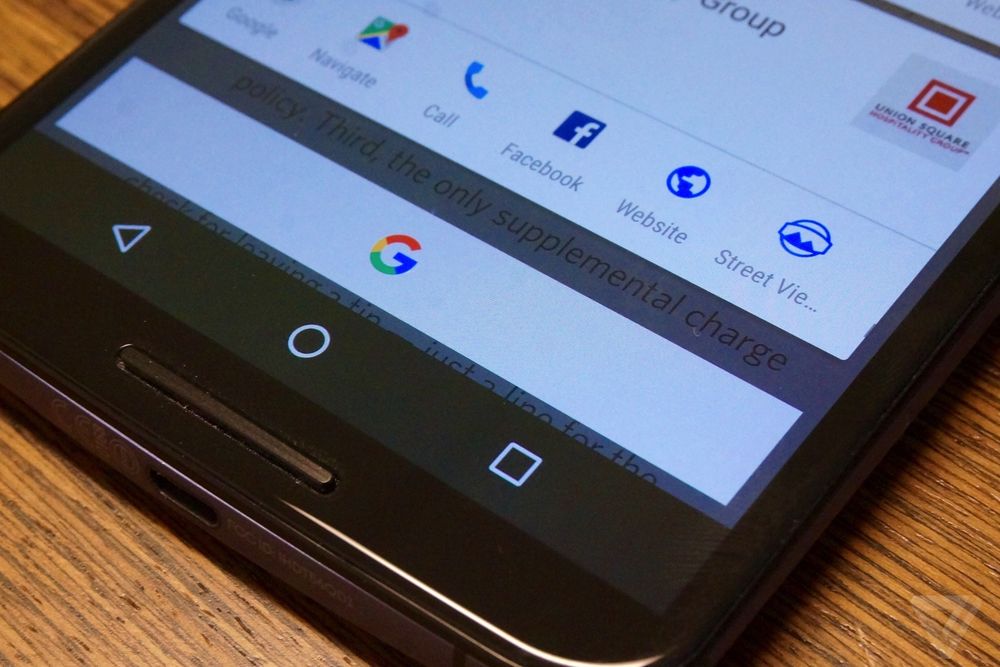
Google’s new logo and microphone are unignorable on the home screen, and the multi-hued G is right there winking at you every time you hold down the home button to access Marshmallow’s premier feature, Now on Tap. Google is listening for your voice and standing ready to turn the contents of any app’s screen into a search or an action. It may be called Android, but more and more it feels like Google.
It’s also quietly refining Android to make it less fiddly and better able to handle the complexities that arise in a modern computer operating system. There have always been little annoyances poking out from the corners of Android, but with Marshmallow, a ton of them have been smoothed out — just like Google’s logo.
The biggest and most important feature in Marshmallow is called Now on Tap. Hold your finger down on the home key inside any app and Android will read the contents of the screen and send them on up to Google’s servers. Google will then parse the data and try to give you useful, contextually relevant information.
If you’re chatting with somebody about dinner and a movie — Google’s stock demo for the feature — Now on Tap will give you a bunch of direct links into apps that can help you with showtimes and restaurant recommendations. If there’s a phone number on your screen, Now on Tap will give you a big old phone button to dial it without making you try to nail the copy / paste text selection with your big old thumb. It can recognize calendar events, addresses, music, and even landmarks.
When it works, it’s as magical as Google Now’s contextual information cards were when they first launched. But all too often, it doesn’t work. I’ve had it bone addresses that worked just fine when I manually selected them and pasted them into Maps, and straight up miss contextual clues by mixing up the book The Martian with the movie (the book, by the way, is better).
I can forgive the occasional miss. What bothers me more is that I’ve made a devil’s bargain with Google: you know damn near everything there is to know about me, now use it. Now on Tap plugs into Google’s vast knowledge of the web, but it seems pretty stupid about Google’s vast knowledge about me. Contacts I talk to regularly don’t pop up in Now on Tap, for example, and the suite of apps I depend on aren’t always options.
For now, the feature is a little frustrating in exactly the same way that Siri was frustrating when I first used it. It’s hard to know what Now on Tap can and can’t do — and even if you do know, sometimes it gets it wrong. There are only so many chances a “guess what you need” feature can whiff before it trains you to think that you can’t rely on it.
That could change over time — Now on Tap talks to Google, so presumably improvements can happen without waiting for an Android OS update that isn’t going to reliably show up anyway. I hope it gets better enough quickly enough for me to trust it, but for now it’s more of a “hey that’s neat” thing than a “I can depend on this” thing.
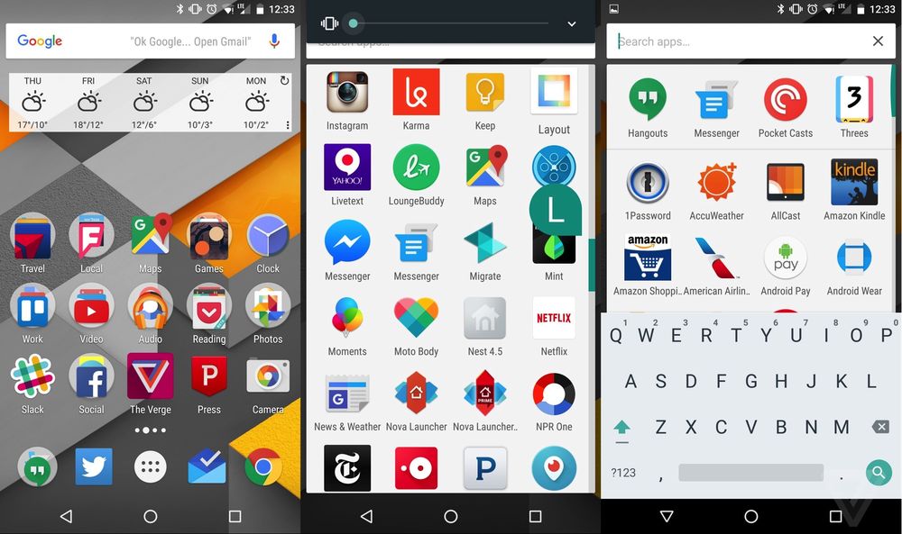
Marshmallow’s home screen is essentially unchanged (beyond the new Google Logo). There are some little differences: apps appear to open from their icons’ location and you can finally uninstall apps from the home screen. Google Now still sits to the left of the home screen, but it’s split out into categories now and has a slightly more refined look. (These changes have already trickled to older phones that haven’t yet received Marshmallow thanks to app updates in the Play Store.)
Hit the button for the app drawer, though, and you’ll find that it’s all new and much improved. Apps are presented in a vertically scrolling list that’s much more intuitive — and there’s a scroll bar that pops up letters to help you quickly jump down to what you want.
Up at the top of the app drawer are four app suggestions that are often spot-on. When I got to the subway, Android knew I wanted PocketCasts for podcasts and Threes for not having to make eye contact with my fellow humans. At work, Android knew that I wanted Twitter and Gmail. There’s one more trick up the app drawer’s sleeve, too: if you hold your finger down on the app button on the home screen, the drawer pops up with a keyboard and a search box. Clever!
All told these changes are nice but won’t feel massive to Android power users, who’ve figured out that third-party launchers like Nova or Apex can do many of the same things. They also seem to (still!) do a better job of restoring from a backup than Google, keeping your icons where you left them. Marshmallow offers developers the ability to back up data to Google Drive so you can restore it to another device later — but the fact that Android still lags so far behind iOS when it comes to getting a phone set up just like your old one is kind of crazy.
Now on Tap and the new app drawer are the things that most users will notice right away. But Marshmallow has a cavalcade of other features that, taken together, serve to clean up a lot of the annoyances that Android users have had to suffer through.
First up, Google is walking back its poorly implemented Do Not Disturb feature that it first launched last year. Instead of hijacking your volume controls, DND now sits in the Quick Settings drawer, out of your way. If you use it and take the time to set up Priority Notifications, go for it, but I never found it all that helpful.
The main benefit of that separation is that adjusting the volume is much more convenient now. Android still does its level best to guess whether you’re trying to adjust media volume, ringtone volume, or alarm volume — but all too often it can get it wrong. When that happens, just hit the little arrow key to get access to sliders for all three volume types.
Android is less likely to ask you whether you want to open a link in a certain app over and over — apps can set themselves as the default app link on install (and yes, there’s a settings area for changing it). SD cards can get set up as “adaptable” now. That means that Android just sees all of your storage as one big lump, so you don’t have to think about where stuff is stored.
Maybe my favorite new feature: Direct Share. When you hit one of those ubiquitous share buttons, Marshmallow will still give you the typical slate of apps you can send a link to. But above them, it puts actual humans with tiny little app icons next to them. I share links to specific people all the time, and now it can take about 500 fewer taps to do it. (Apps need to support Direct Share, however, and very few do, including Google
Add up all the little refinements to Android in Marshmallow, and you end up with an OS that feels much more user-friendly than it used to be — but without discarding the power and customizability that Android users have grown accustomed to. It’s a great OS, though if it were me, I’d call it something like Android 5.3 instead of 6.0. I’m just not sure it’s as huge a leap forward as previous versions. But if we take that version number at face value, what Marshmallow represents is a platform that Google intends to build on. So what will it build?
It seems like every computer is trying to figure stuff out for you these days. Apple has Siri, Windows has Cortana, Amazon has Alexa, and hell, Facebook is testing an assistant called M. But Google just has, well, Google. There’s no name, no gendered personality, no separate virtual person that’s working with the operating system. There’s just Google, and the distinction between Google the search company and Android the operating system is getting harder to define over time.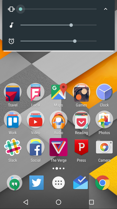
ANDROID IS MORE GOOGLE THAN EVER
It’s muddier than ever with Android 6.0. Now on Tap has the potential to give Google insight into apps, just like it knows everything about the web — as long as Google can keep it useful enough to entice users to long-press that home button. There might be privacy implications to worry about, though Google has insisted that it doesn’t store that search data.
Assuming Google can improve Now on Tap (and quell privacy concerns), it might need to think about another rebranding. Google itself got a new logo, maybe Android is going to need a new name soon. The best candidate is obvious: Google OS.
For More Details Click Here


