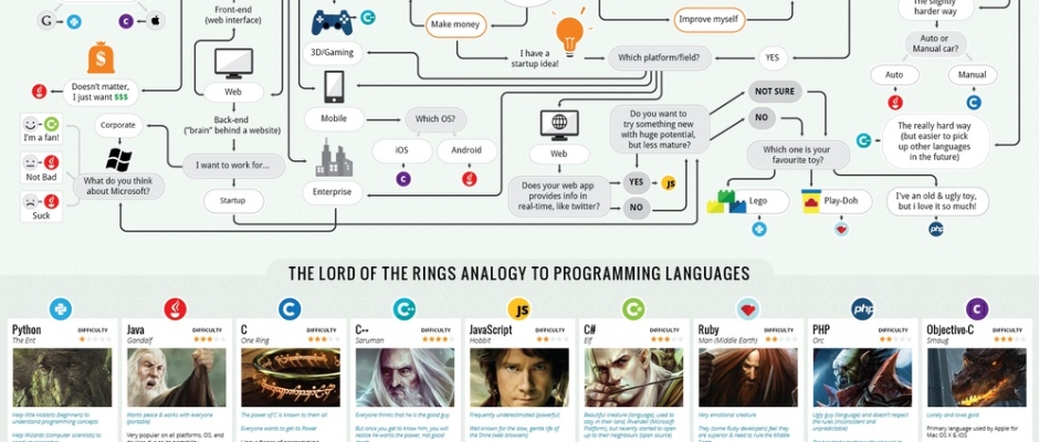
Which Programming Language Should I Learn First [ XpertLab ]?
27th June 2015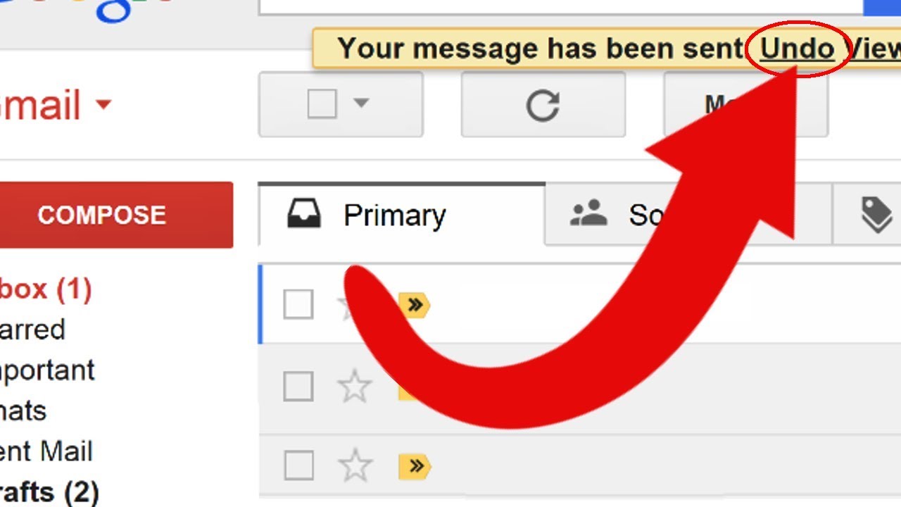
Gmail New Option Undo Send Mail
3rd July 2015all of Facebook’s impressive records and achievements, the social network’s logo and wordmark have always remained resolutely basic. The company has now decided to freshen up its look, but there’s no major redesign happening: the simple old “facebook” is now typed out in an even less distinctive font than before, with the most obvious change being the switch from a double-story “a” to a single-story one. The refreshed look features more white space and thinner lettering, likely in an effort to make the wordmark more legible at lower resolutions on mobile devices.
Facebook’s Josh Higgins tells Brand New that the company “set out to modernize the logo to make it feel more friendly and approachable.” Many directions were explored, according to Higgins, but ultimately the simple and familiar look of the old wordmark was preferred, and Facebook just built out a new custom typeface around it. The new Facebook identity will be showing up across Facebook’s various sites and apps soon, with the large F logo and favicon remaining unchanged.
