
Best Web Designing Company in Junagadh
20th November 2021
RETHINKDB: THE REAL-TIME DATABASE FOR THE WEB
23rd November 2021
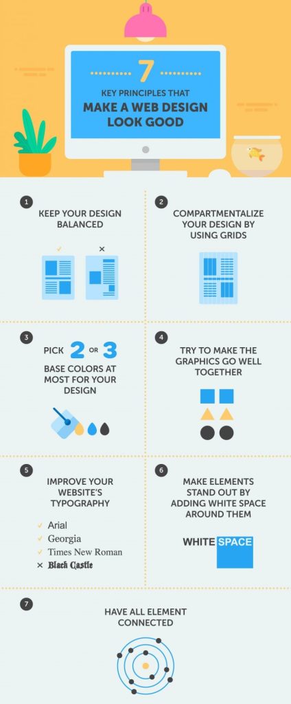
How to design a good-looking website?
- Keep your design balanced.
- Compartmentalize your design by using grids.
- Pick two or three base colors at most for your design
- Improve your website’s typography.
- Make elements stand out by adding white space around them.
- Have all elements connected.
By following some simple pointers, anyone should be able to create a visually pleasing design and take one step closer to fame. Okay, it’s not that simple, and talent and experience do matter, but anyone can turn their home page into something prettier within mere minutes.
1. Keep your design balanced.
Balance is all about ensuring that your design does not tip to one side or the other. It is like the balance of weight in achieving symmetry or asymmetry.
This is what we call asymmetrical balance, and this is what balance is about. If you’re not careful about how you lay things out, the design will become unbalanced rather quickly. You can manipulate the visual weight of a design in many ways, such as with color, size, and the addition or removal of elements. If you were to make the cross, say, a vibrant orange, it would become heavier and perhaps throw the layout off balance again. Achieving asymmetrical balance is an especially delicate matter that takes time to fine-tune and a somewhat trained eye to really pull off.
2. Compartmentalize your design by using grids.
The concept of grids is closely related to that of balance. Grids are a series of horizontal and vertical rulers that help you “compartmentalize” a design. Think of columns. Columns improve readability, making a page’s content easier to absorb. Spacing and the use of the Rule of Thirds make everything easier on the eye.
3. Pick two or three base colors at most for your design.
What if you changed the base red on the First Twenty website (above) to lime green? Would it look good? Most likely not. Because it does not belong to the same color palette (and of course lime green isn’t the easiest color to work with). Websites such as ColourLovers exist for a reason. You can’t just pick your colors Rambo-style, guns blazing. Some colors go well together, others don’t. A lot of theories on colors and their combinations exist, including conventions on monochrome and contrasting schemes, but a lot comes down to common sense and having a feel for it.
4. Improve your website’s typography.
The art of type is a tricky subject to talk about because it encompasses so many elements. While it can be regarded as a branch of design, one can spend a lifetime mastering all of its aspects. This is not the place to provide a complete typographic reference, so we will limit our discussion to what will benefit you in the short term.
Web typography is handicapped compared to print typography. The biggest difference is our lack of complete control over the appearance of type on the Web, due to its dynamic character. Obviously, dynamic rendering has its strengths, but Web designers have little control over the results, at least for now. Missing fonts on the user’s computer, differences in browser and platform rendering, and generally subpar support in CSS make Web typography a daunting if not frustrating task. But while we may have to wait for CSS 3 for Web typography to reach its full potential, we have the means now to make it look interesting and, more importantly, pretty.
5. Make elements stand out by adding white space around them.
White space, or negative space, has to do with what is not there. Like measure and leading, white space gives text some breathing room and spatial peace. You can make elements stand out by adding white space around them. Copy, for example, shouldn’t look cramped. To ensure readability, make sure paragraphs have sufficient padding.
Perfume ads — or any ad for a luxury product for that matter — are known for their use of white space… loads of it; and a serif typeface for good measure.
6. Have all elements connected.
“Connection” is a bit of a made-up term here, but it seems to be the best one for what we mean. The connection here refers to a Web design that has both unity and consistency. These two attributes demonstrate the professionalism of a design (and thus its designer). They are very broad attributes. A design should be consistent in its use of colors, in its range of fonts, with its icons, etc. All of these aspects count; a design can look great and still suffer from inconsistencies.
When a design is inconsistent, its unity can be lost on the user. Unity is slightly different from consistency. Unity refers to how the different elements in a design interact and fit together. For example, do the colors and graphics match? Does everything contribute to one unified message? Consistency, on the other hand, is found between the pages of a design.
Unity is perhaps the more important of the two. Without unity, having a good design is hard. Inconsistency, however, may look a bit “sloppy” but may not make the design “bad.”
Of the seven principles addressed in this article, the connection is the most important. The connection has to do with how all elements come together: balance, grid, colors, graphics, type, and white space. It is sort of the glue that binds everything together. Without this glue, the design falls apart. You could have a pretty type and a brilliant and meticulously chosen color palette, but if the graphics are awful or simply don’t match or if everything is crammed together without thought, the design will fail.
This is the hardest part of designing. It is not something that can be easily taught or necessarily be taught at all. A little natural ability and experience are required. But it is what it is, and it makes a design look good in the end.
Conclusion
Good Web design is not limited to the seven key principles discussed here. Aspects such as accessibility, readability, and usability play a part, too.
This is the reason why Web design is so difficult. Getting your feet wet in design is easy, especially today, with so many content management systems, blogging tools, and themes readily available. But truly mastering all of the facets of Web design takes time and, let’s be honest, talent. Having the ability to craft pretty designs is just one facet, but an important one.