SwiftUi
23rd December 2020
Virtual Reality
30th December 2020The first constraint (or opportunity) when designing any app is the screen size that the device on which it is accessed is going to offer. With various wearables hitting the market and featuring some exquisite options, a whole new opportunity has emerged for app developers and designers. At face value, the restricted screen size leaves less room for user interaction. While some of the following guidelines may overlap with UI guidelines for other devices, wearable devices require specific techniques for creating great user experiences. A single flick of wrist should be enough to get the users go gaga!
- Design Around the User
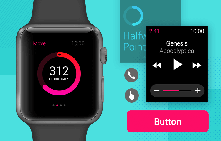
An app needs to function with minimum user interaction. Keeping this in mind, try to make the activation point of your app with a single gesture – be it a swipe, touch or a voice command. The lesser the time spent by the user fiddling around with your app, the more it will be loved! Users should be able to smoothly navigate through the app and use it as per their needs. More importantly, they should be able to do so using the modes of interaction that the watch being used provides. For example, the Apple Watch has 4 different modes of user interactions: action-based events, gestures, force touch and the use of the digital crown.
This mindset should go beyond the simple counting of the number of steps (as otherwise we will end up with yet-another 3-click rule). Combine empathy with technology to provide a great user experience and get a leading edge over your competition – something which is always difficult to achieve in a saturated app marketplace.
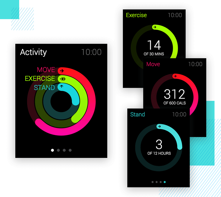
Key here is the need for a visual hierarchy. This needs be created in a specific manner by considering the details of the watch design and how well you wish to present the view to your users. When you, as a designer, concentrate on finer details; the hierarchy will have some real visual impact in the end.
The major difference between a wearable and a phone is that the latter offers many screens for the user to dig deep with effective scrolling. However, the issue with the former is that one cannot apply the same design policy. A great workaround is to distill content to the bare minimum by carefully evaluating what your users need to see in order to achieve their goals. This greatly facilitates the next step, that is, visually representing that information in such a way that the user can see and understand it at a quick glance.
- Keep Your App Predictive
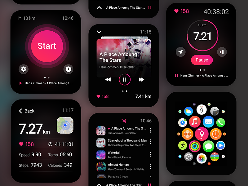
A user should always feel at ease while using your app. Since interaction modes are restricted, your app should be a step beyond the user by, where possible, anticipating their needs. Thinking beyond the contextual content, one should concentrate more on predictive intelligence. The best app on any smartwatch is one that empowers its users to achieve their goals through quick and simple access. This leads to delight and they will soon find themselves using your app over and over again. And speaking of goal achievement – the user interface of your app should be so intuitive that a potential user will know within a glance what your app does and whether it addresses their need. This is what will set you apart from your competition when users are browsing through the marketplace.
The ultimate aim is to provide the users with information at the right time and in the correct format. One way of achieving this is to track and store the user’s previous interactions. Adhering to the objective of predictive intelligence by designing something that can work as per the routine of the user will define contextual design in an outstanding way. Collecting the user information based on the app usage and mining data around it will help in keeping an app more accurate, while achieving a degree of customization.
- Presentation is Key
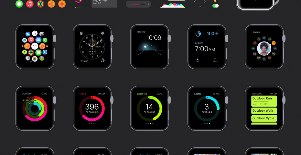
If screen real estate is precious for mobile devices, then one can only imagine how valuable it is in the case of a watch. Take for example the Apple watch. The 38mm version has a resolution of 340 x 272px while the 42mm version has a 390 x 312px resolution. The advice here is obvious – make sure you use it well. With one simple glance, your user should be able to view and understand any information that is deemed as being critical in the context of your app. Use subtle colours and incorporate attractive layouts to keep the user informed and awestruck. With recognition comes responsibility, so ensure that you present your app in a way that it balances functionality, usability and your creativity in the best possible way. A word of advice here is to ensure that you choose an appropriate:
Font type: The font used in your app should be readable and well condensed so that the letters don’t look distorted. Remeber that your characters should be legible at a glance. The app should sense the gestures of the user and the designer should take care of the font size and spacing accordingly. With every different gesture, the font should could be required to change while still allowing the user to use your app without any hassle. Make sure to keep the font type consistent so that the readability of your app helps in the overall delivery of a great user experience.
Colour scheme: Appropriate contrast should be used so that the text and its background are sufficiently distinguishable. However, try to avoid using bright colours. Depending on the branding of your app, use a key colour that consistently stays throughout the various ‘screens’ of your app.
- The Watch is a Personal Statement … and so is Your App!
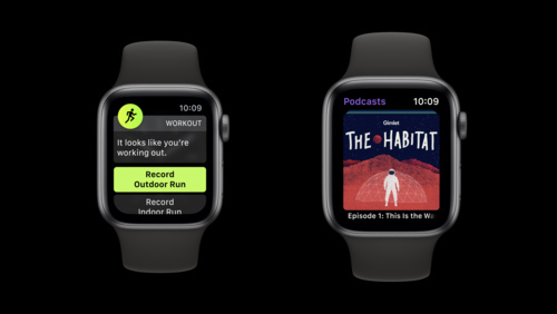
The user interface should have a simple, minimalist, yet extraordinary aesthetic appeal to it. Remember, this is not a mobile phone or a laptop where complicated layouts are welcomed. This is why UI design for apps on watches require a ‘back-to-basics’ design approach, starting with espectial attention to alignment, symmetry and simple, seamless transitions.
There is a lot to learn from the guidelines published by watch operating system manufacturers themselves (e.g. Apple’s visual design guidelines for the Apple Watch and Android’s Design Principles for Android Wear ). Let the visual appeal of your app speak for itself. Let it tell the user the purpose for which it is designed.
The icons that you use should explicitly represent your brand. Then again especial consideration needs to be devoted to factor in the position where they will appear so as to ensure that they are appropriately designed. The app itself should be able to mask the icon shape and dynamically adjust it in such a way that it adapts to the device on which it is being used. While taking care of all these aspects, make sure to use intuitive iconography. If the icon is appropriately conceptualized, elegant and designed to please the eye, it will reduce the user’s cognitive load.
- Entice Your Users to Explore the App.
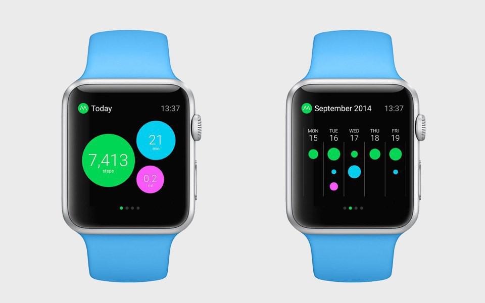
Design your app in such a way that it entices your users to explore it. Let them tap, use, explore and learn. If they make a mistake, make it simple for them to understand and to navigate back to where they were (yes, this is simpler than when designing apps for other devices). Do not be particularly concerned with users making mistake at this stage. Who doesn’t make mistakes? It’s actually all about learning more with every step! But do make sure that your app is able to handle this haphazard usage both from a functionality perspective and from the way it communicates to the user. Although interaction through the use of glances isn’t compulsory for every app that you design for a wearable, you can use it to keep the user enticed.
- Don’t let Your App Eat Away all the Power
If the user switches to ambient mode, make sure to keep the app layout basic, so that there is less power consumption. No one will welcome an application if it drains away the power from their wearable device – be it a watch or otherwise.
- Try Not to be a Constant Intruder or an Irritating Pal
Since the wearable will be in constant touch with the user’s body, make sure that it does not bother them by for example unnecessarily vibrating with each option that is selected. If you have conducted user testing and the results justify that each operation should be complemented with a vibration (for example), then make sure that you make it very easy for users to turn such a feature off (through, for example, a long press).
Similarly, while you may have taken care to include short look and long look notifications, you need to pay attention to deliver information modally to all the users of your app. Having a modal design is extremely important to keep a users in flow with all his / her previous interactions. The modal frequency should however be minimized so as to ensure that it isn’t disruptive.


