How to Build a Custom CRM Software for Your Business
22nd September 2020
Benefits of Using SVG
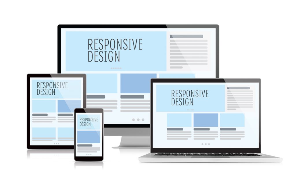
24th September 2020Responsive design is a way of designing and developing a website so the content, images, and site structure provide an optimal, seamless viewing experience across a wide variety of devices — from desktop to tablet to smartphone.

” As of April 21, 2015, Google’s algorithm now incorporates a website’s “mobile-friendliness” into its rankings. The algorithm will scan each page for load times, mobile responsive design elements, and best mobile practices – and websites that are not optimized for mobile will appear lower down on Google’s search rankings. “
Given this substantial change to Google’s algorithm, the need for companies to optimize their websites for mobile has never been greater. And while companies can always create a separate mobile website to achieve that end, a mobile responsive website is a significantly more efficient and cost-effective solution that seamlessly caters to both mobile and desktop users. To not have a mobile website can cause organizations to lose out entirely on a fast growing audience.
In most western countries 50-60% of searches is conducted on a mobile device now, with that number rising every year
Here are the five key reasons we encourage the companies we work with to adopt a mobile responsive website:
1. Mobile usage is rapidly increasing :
“More than 20% of Google searches are now performed via mobile device — Smart Insights”
“57% of users are “multi-screening”, accessing websites on both their desktop and mobile devices. — Smart Insights”
The reality is that there’s an increasing number of users searching the Internet and accessing websites via mobile device — and these users expect an optimal viewing experience across the board. If your mobile website is frustrating or difficult to use, they’ll simply leave your site and go somewhere else.
Responsive design ensures your visitors can easily and intuitively navigate your website regardless of the device they choose, resulting in satisfied users and increased conversions.
2. Google prefers responsive design :
Responsive design is Google’s preferred design pattern because it doesn’t create two copies of the same site — a desktop version and a mobile version. Rather, it creates one site — with the same URL and HTML — that adapts, fits, and retracts to accommodate a variety of devices.
This is appealing for a number of reasons. To begin, it provides an optimal user experience. Visitors access a single URL and the website adapts automatically to fit their screen. In addition, it’s more efficient for Google because they aren’t required to crawl multiple sites to accurately assign indexing properties.
3. Responsive design is efficient and easier to manage :
Having both a desktop and a mobile version of your company’s website is less efficient and cost-effective than embracing responsive design.
Two separate websites mean your team has to do everything twice — from routine site maintenance to running SEO campaigns. Responsive design creates a single site that meets your company’s mobile and desktop needs, without requiring additional resources.
4. Responsive design increases conversions :
According to Google, if your mobile site is difficult to navigate, there’s a 61% chance visitors will leave. However, if users have a positive interaction with your mobile site, they are 67% more likely to convert.
Responsive design increases conversions by providing a seamless, optimal user experience that users appreciate. To begin, it doesn’t require redirection to an alternate URL based on the user’s device, which speeds up load times. Plus, because it scales to fit any device, a mobile responsive website doesn’t require the user to put in additional work, such as scrolling or zooming, to accurately navigate the site. Both of these features make visitors happy — which increases conversions.
5. Responsive design increases relevance :
by allowing for organizations to cater their message to be appropriate with the device and browsing behavior of that device. Organizations can offer a web form for desktop lead inquiries, for example. While on mobile, users may encounter a highlighted click-to-call action instead. Messaging may also be adapted to the device–ensuring a relevant and fluid experience that engages and delights.


