IS GOOGLE FUCHSIA, THE NEW ANDROID?
10th December 2020
WHY CHOOSE FLUTTER FOR CROSS PLATFORM MOBILE APP DEVELOPMENT?
11th December 2020
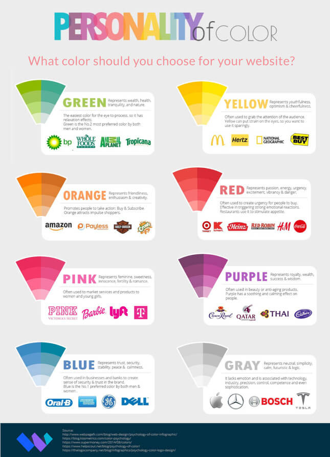
Color is a massive aspect of branding. For example, you may have noticed that almost every fast food restaurant uses red and yellow in their logos, as these colors encourage hunger and friendliness. However, Subway elects to use green instead of red, to reinforce their “eat fresh” branding.
Seeing how important colors are to your brand, you might be spurred into wanting to rebrand your website. Or maybe you’re branding for the first time. Either way, this article is here to help you decide on what colors to implement into your website.
Choose a primary color
The best way to decide on a primary color is to think about the vibe of your product or service, and peruse colors that fit that vibe to find one you like. Here are some examples:
- Red: Coca-Cola or Nintendo – Implies excitement or happiness
- Orange: Nickelodeon or Fanta – Implies a friendly, fun time is ahead
- Yellow: Nikon or McDonalds – Implies optimism and happiness
- Green: Whole Foods or Animal Planet – Implies freshness and nature
- Blue: Walmart or American Express – Implies dependability and reassurance
- Purple: Hallmark or Cadbury – Implies a distinguished brand that has a history of quality
- Brown: Nespresso or UPS – Implies a reliable product that can be used by anyone
- Black: Chanel or Adidas – Implies luxury or elegance
- White: Apple or Nike – Implies sleek, user-friendly products
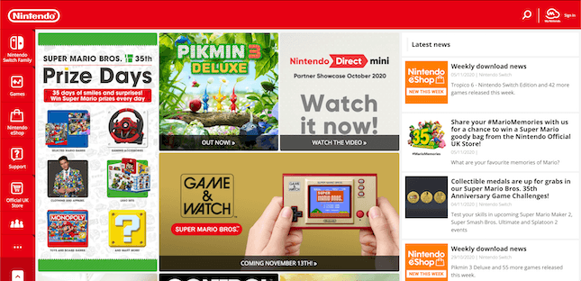
If you already have a colored logo, it makes sense to have a primary color that matches your existing branding. Nintendo’s branding is very red, and this comes through on their homepage.
Use consistent saturation
One thing you can do to strengthen your brand is to use various colors with a similar saturation. Saturation is another way of saying a color’s brightness. Have a look at drink company Innocent’s usage of color:
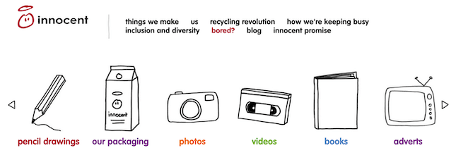
Here they have six different colors, but none of them feel out of place or jarring. That’s because their saturation is muted to the same level, making it feel consistent.
Use the same color, but vary saturation

All five of them are a similar green, but have varying levels of brightness. These vary up the visuals of the page, while also reinforcing the idea that a lighter green is synonymous with TechCrunch.
For Color Understanding, check out infographic below.