The Complete History of Artificial Intelligence (AI)
23rd December 2025
Why Intentions Fail & Habits Succeed !
19th January 2026
In an era of information overload, design is no longer about adding more it’s about saying more with less. This shift has given rise to Bold Minimalism, a design approach that blends clean simplicity with strong visual impact. Unlike traditional minimalism, which often feels subtle or quiet, bold minimalism commands attention while remaining uncluttered.
What Is Bold Minimalism?
Bold minimalism is a modern evolution of classic minimalism. While traditional minimalism focuses on restraint and neutrality, bold minimalism introduces contrast, scale, and confidence.
It combines:
- Minimal layouts
- Strong typography
- High-contrast color palettes
- Intentional white space
- Statement visuals
The goal is simple: clarity without compromise, simplicity with personality.
Why Bold Minimalism Is Trending Now
1. Shorter Attention Spans
Users decide within seconds whether to stay on a website or scroll past a post. Bold minimalism helps deliver a clear message instantly without distractions.
2. Mobile-First Design
Minimal layouts with bold elements adapt beautifully across screen sizes. Large text, strong icons, and focused visuals improve readability on mobile devices.
3. Brand Differentiation
In a world of template-based design, bold minimalism helps brands stand out by being intentional rather than decorative.
4. Digital Fatigue
As users grow tired of over-designed interfaces, clean and confident visuals feel refreshing and trustworthy.

Key Elements of Bold Minimalist Design
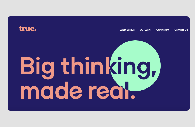
1. Strong Typography as a Hero Element
Typography often replaces imagery in bold minimalist design. Oversized headlines, expressive fonts, and confident spacing turn words into visuals.
Trends include:
- Extra-bold sans-serif fonts
- High contrast between headings and body text
- Limited font families (often just one or two)
Typography isn’t just readable it becomes the design itself.
2. Intentional Use of White Space
White space (or negative space) is no longer empty—it’s powerful.
Designers use white space to:
- Guide user focus
- Improve content hierarchy
- Make bold elements stand out
The more minimal the layout, the more impactful each element feels.
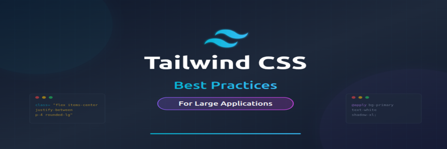
3. Limited but High-Contrast Color Palettes
Bold minimalism avoids excessive colors but isn’t afraid of strong contrasts.
Common approaches:
- Black & white with one accent color
- Neutral backgrounds with vibrant highlights
- Dark mode designs with bold typography
Color is used sparingly but strategically to draw attention where it matters most.
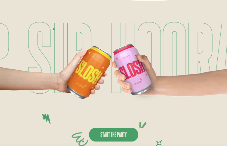
4. Large-Scale Visuals
Instead of many small elements, bold minimalism uses fewer, larger components:
- Oversized buttons
- Full-width sections
- Large icons or illustrations
This creates confidence and visual rhythm while maintaining simplicity.
5. Purpose-Driven Design Choices
Nothing in bold minimalism is accidental. Every element must serve a purpose whether it’s guiding action, conveying emotion, or reinforcing brand identity.
If an element doesn’t add value, it doesn’t belong.
Final Thoughts
Bold minimalism is not about doing less it’s about doing what matters. By combining clarity with confidence, designers can create visuals that are clean, impactful, and emotionally engaging.
In a noisy digital world, bold minimalism speaks clearly and that’s its true power.
For More Info: XpertLab
Related Blog: Visual Hierarchy