IWatch Application Development
21st September 2019
Types of Software Testing
23rd September 2019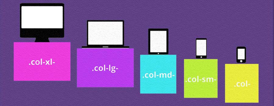
A grid is simply a collection of horizontal and vertical lines creating a pattern against which we can line up our design elements. They help us to create designs where elements don’t jump around or change width as we move from page to page, providing greater consistency on our websites.
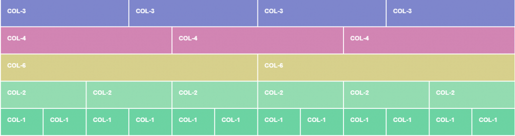
Bootstrap’s grid system is built with flexbox and allows up to 12 columns across the page.
If you do not want to use all 12 column individually, you can group the columns together to create wider columns:
The grid system is responsive, and the columns will re-arrange automatically depending on the screen size.
Make sure that the sum adds up to 12 or fewer (it is not required that you use all 12 available columns).
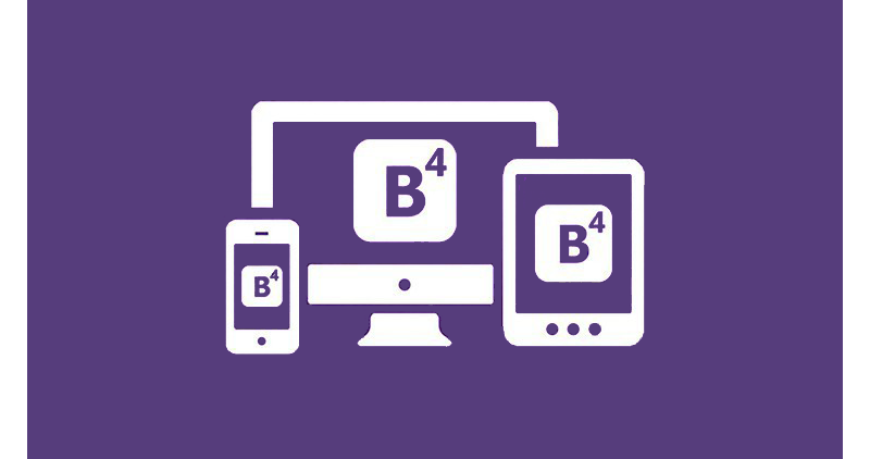
Bootstrap 4 Grid System
Bootstrap’s grid system uses a series of containers, rows, and columns to layout and align content.
Bootstrap grid system work across multiple devices.
The Bootstrap 4 grid system has five classes:
1. .col- (extra small devices – screen width less than 576px)
2. .col-sm- (small devices – screen width equal to or greater than 576px)
3. .col-md- (medium devices – screen width equal to or greater than 768px)
4. .col-lg- (large devices – screen width equal to or greater than 992px)
5. .col-xl- (xlarge devices – screen width equal to or greater than 1200px)
Grid System Rules
- Rows must be placed within a .container (fixed-width) or .container-fluid (full-width) for proper alignment and padding
- Use rows to create horizontal groups of columns
- Content should be placed within columns, and only columns may be immediate children of rows
- Column widths are in percentage, so they are always fluid and sized relative to their parent element