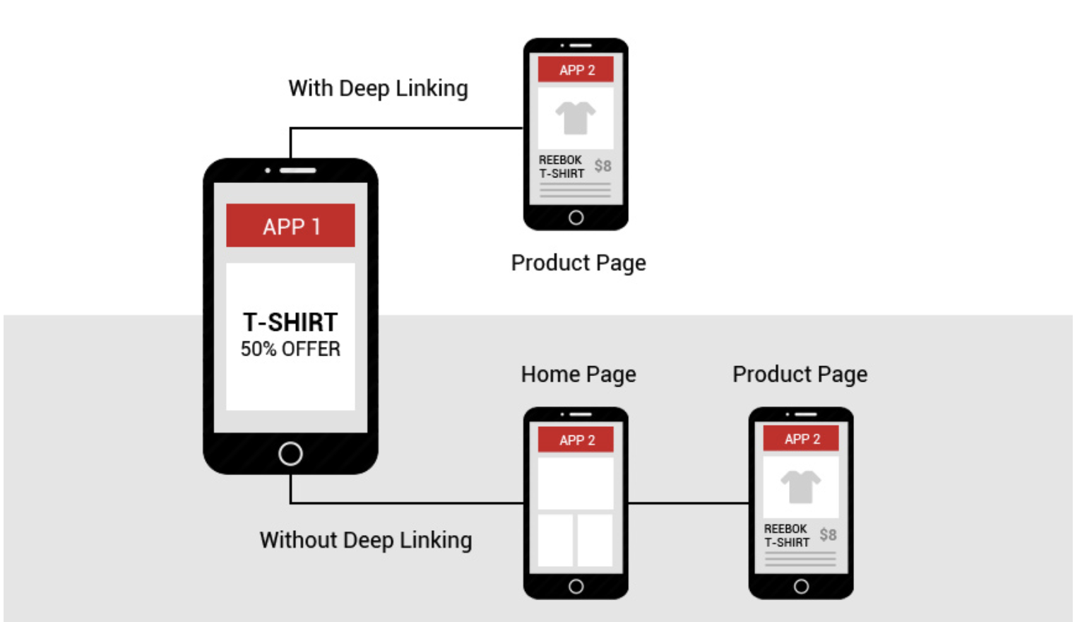
Deep Linking
25th March 2021
What is the importance of web design for your audience?
27th March 2021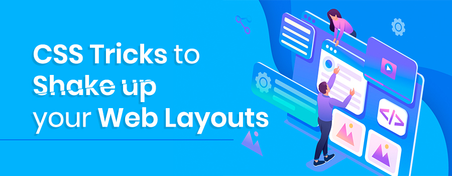
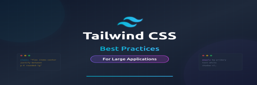
Learning new CSS tricks is one of the best ways to shake up your website design. If you’ve been working in the web industry for a while, you may feel you’re always coding or designing the same layouts. Trends come and go but the majority of sites look the same – using the 12-column grid, two and three-column boxed layouts and similar shapes. Not only is it getting a little boring to look at, but the user experience isn’t that great.
01. Explore CSS blend modes
Duotone imagery and colouriser effects are some of the hottest web design trends. They are widely popular across the web thanks to Spotify, which implements them cohesively. Now you can finally stop creating multiple different coloured versions of your assets, and apply the effects directly in the browser.
Using CSS blend modes is not only a great way to unify the look of the content across websites, it also enables you to set different colour versions of an image, changing only one value in CSS: the colour. There are 15 possible blend mode values, including screen, overlay, lighten and darken.
There are a couple of implementation methods, depending on the type of element you would like to apply the effect to. For example, you can use background-image and background-colour set on the container background-blend-mode: darken;, or create an overlay with pseudo-elements (i.e. :before and :after) on the image wrapper in order to get a colourising effect.
To achieve a satisfying duotone effect, it’s recommended that you use a high-contrast black and white image. You can do this by applying CSS filters to set greyscale and a high contrast level.
02. Add a mask
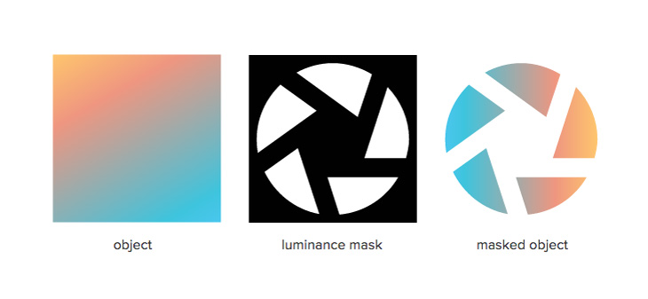
Masking tells your browser which asset elements should be visible, and is very useful for building creative shapes and layouts. Masking can be done in three ways: using a raster image (eg PNG format with transparency parts), CSS gradients or SVG elements.
Note that unlike a typical raster image, SVG can be scaled or transformed without a significant loss of quality.
img {
  mask-image: url(‘mask.png’) linear-gradient(-45deg,
                        rgba(0,0,0,1) 20%, rgba(0,0,0,0) 50%);
  mask-image: url(#masking); /*referencing to the element generated and defined in SVG code*/
}
It’s important to mention that Firefox supports only the latest one, so we need to use an inline SVG mask element. What if we use a raster image with transparency levels? The transparent parts of the image won’t be seen – so in other words, the opaque fragments will be displayed, hiding other pieces.
Masking is particularly powerful because it enables you to apply the same properties to background images, defining their position, size and repetition.
03. Try SVG for animation
To be honest, I cannot imagine today’s web without SVG (scalable vector graphics). Its name speaks for itself – it scales, so it answers all concerns regarding responsive web design. The SVG graphic will be crisp no matter the screen resolution of the device it’s viewed on.
Aside from scalability, there is another feature that should encourage you to play with SVG: the ability to manipulate SVG with CSS. If you have never tried dabbling in CSS animations and SVG code, you must try it now – it’s unbelievable how quickly you can achieve amazing effects.
04. Think outside the box
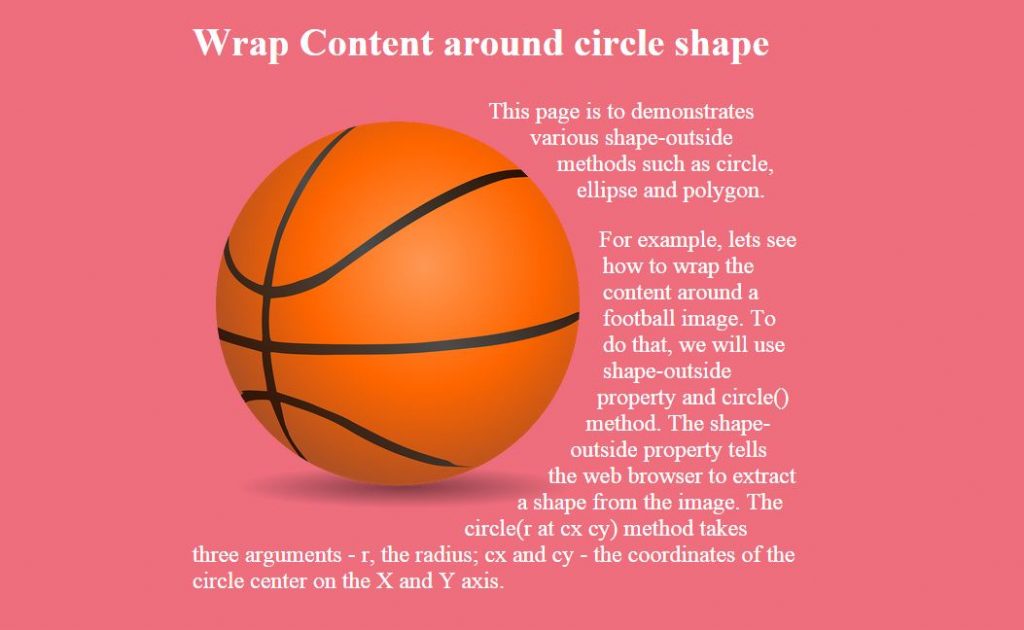
Shape-outside and shape-inside to the rescue! Who said that text containers always need to be rectangular? Let’s step out of the box, literally, and discover new forms making our page layouts richer and less boxy. shape-outside and shape-inside properties allow you to wrap your content around custom paths in CSS.
If you’d like to create more room between your element and the content, use the shape-margin property, which will act just like a margin. Shape functions can be animated, but only for defined polygons – the url() function unfortunately is not able to be animated.
Browser support for shape-outside is limited at the moment, but keep your fingers crossed for its fast implementation in other browsers.