What is Mobile App Testing?
14th August 2025
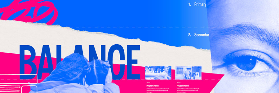
Remix or Next.js? Choosing the Right Framework for Your Web App
23rd August 2025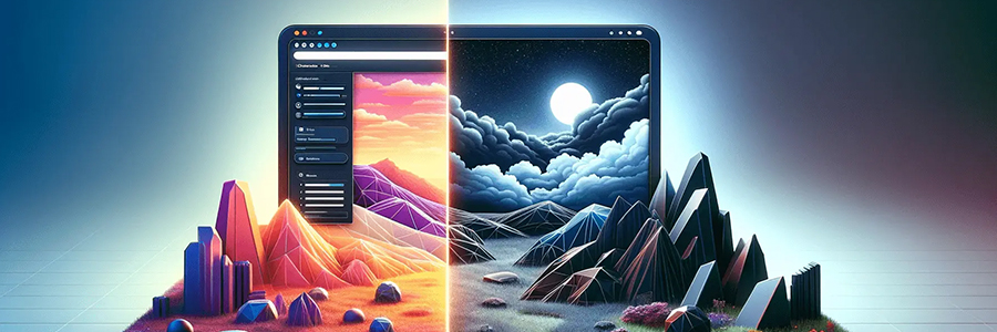
In recent years, dark mode has moved from being just a design trend to becoming an essential feature in apps, websites, and operating systems. What started as a sleek visual option has now evolved into a functional, psychological, and branding choice that both designers and users value.
🌑 The Evolution of Dark Mode
- Early Days – Aesthetic Choice: Initially, dark mode was popularized by developers, coders, and creative professionals who worked long hours in front of screens. It felt futuristic and reduced visual strain in low-light environments.
- Mainstream Adoption: Platforms like iOS, Android, and Windows integrated system-wide dark themes, making it a standard design feature rather than a luxury.
- Brand Identity Shift: Now, brands use dark mode not only for accessibility and comfort but also to communicate style, elegance, and uniqueness.
👀 The Psychology of Dark Mode
Design is deeply tied to human psychology. Dark mode impacts perception and emotions in several ways:
- Eye Comfort & Fatigue Reduction
- In low-light conditions, dark mode decreases glare and reduces eye strain.
- However, in bright daylight, light mode is still easier to read, making toggles between the two necessary.
- Emotional Perception
- Dark mode often feels modern, premium, and immersive.
- It can give a sense of focus and calm, making it ideal for entertainment, gaming, or reading apps.
- Color Psychology
- Bright elements on a dark background stand out more, creating a stronger visual hierarchy.
- Brands often highlight CTAs (buttons, icons) with contrasting colors that appear more vibrant in dark UI.

🎨 Dark Mode & Brand Identity
Dark mode isn’t just about comfort—it’s also a branding opportunity.
- Luxury & Premium Brands: Black or dark backgrounds create a high-end feel (think Apple, Tesla).
- Entertainment & Creativity Platforms: Dark mode enhances immersion, which is why platforms like Netflix, Spotify, and Behance use it heavily.
- Tech & Productivity Apps: Tools like Slack, Discord, and GitHub offer dark modes to cater to their user base of night owls and coders.
By adopting dark mode, brands can reinforce their personality—whether elegant, bold, or futuristic.
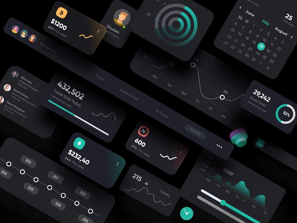
🔮 The Future of Dark Mode
The evolution of dark mode doesn’t stop here. We’re moving towards:
- Adaptive Interfaces: UIs that automatically adjust based on time of day, lighting conditions, or even user eye strain.
- Brand-Customized Dark Themes: Instead of one dark mode, brands will offer signature dark themes that reflect their personality.
- Energy-Saving UI: Especially on OLED screens, dark mode consumes less power, making it eco-friendly as well.
For More Details: XpertLab
Related Blog: UI/UX Trends 2025