

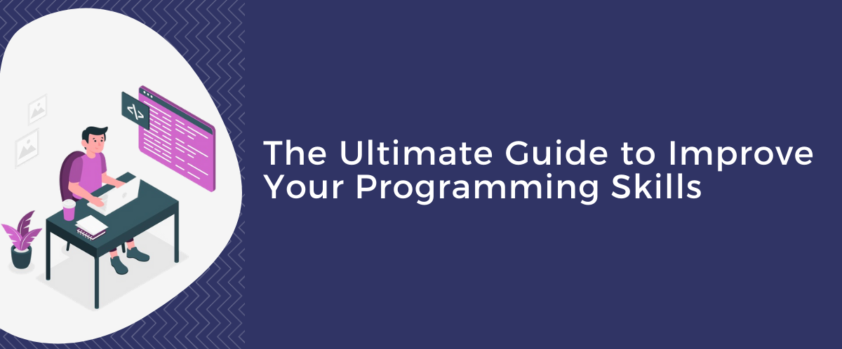
How to Improve Your Programming Skills
14th February 2022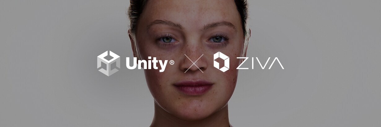
Unity acquires Ziva Dynamics
19th February 2022
What is Responsive App Design?
Responsive design simply means using a single code set that responds to various changes to the layout of the devices. The responsive app lay out its UI according to the screen size and shape of the device. From smartwatch, phone, tablet to laptop, an app developed responsive UI can run on multiple devices without having to develop different interfaces of the application.
The same app will adjust the size of the page according to the screen when the user either resizes the window on the laptop or changes the orientation of the phone or tablet.
Important Elements to Focus To Create Responsive Layout
In recent years, developing a responsive app has become a hot topic of the town but how to make it happen in the real world? What essential things do you need to focus on?
In responsive design, there are majorly three things to consider- Size, Orientation, and Device type. When any one of these elements changes, the app UI changes. You can also choose to hire mobile app developer that can make it done for you. But..
Now the question is what makes it so demanding for the app development?
Here’s a list of some features and qualities that makes it so demanding:
- Being a cross-platform framework, it allows developers to create an app for iOS and Android by using the same code-base.
- Flutter is an open-source framework, so it is free to use and provide extensive documentation and community support to make it easier even for beginners to get started with Flutter.
- This framework is simple to learn and easy to use as it is based on Google’s in-house language that is Dart.
- Despite being a young framework, Flutter has become a prime choice of leading companies like Google, Alibaba, eBay, Emaar and many more.
- With hot reload feature, launching or updating a Flutter based app is quite simple and fast. Developers can instantly make changes in the code on emulators, simulators and hardware in a second, without having to restart the running app. It is one of the biggest reasons that make Flutter the first choice of developers for building UIs, fixing bugs and adding a new feature.
Hopefully, you are convinced that Flutter has become so famous for developing applications. As far as building a responsive layout in the application, Android and iOS adopt different approaches to handle layouts for different screen sizes natively.
How Flutter is Different and Help You Create a Responsive UI of the App?
Just because we are claiming that creating responsive layouts in Flutter is quite more straightforward and easier, therefore, many of you are curious to ask these two questions instead of directly moving to hire software development company:
What widgets should I Use in App That adapts to Screens of Different Sizes?
How Can You Get The Information About the Screen Size and How Can You Use It While Writing the UI Code?
We’ll answer these questions but let’s first talk about the second question because it is the heart of the issue.
So there are here major ways to meet your goals:
1. MediaQuery
One potential way to get information from the MediaQueryData of the MediaQuery root that is “InheritedWidget”. It provides some valuable information on Orientation and ScreenSize, that enables you to determine which layout to display based on the current orientation, what type of screen (mobile, tablet or Desktop), and screen size on which app is being displayed on.
Now the question is how to use it?
Let’s learn with the example of building a chat app in Flutter that responds to layout changes:
- To get started with the changes in the layout of the chat page using MediaQuery, you need first to check the orientation from MediaQuery– If it is a landscape, then you’ll have a detail page.
- You need to declare a child widget to use it later.
- If you have a details page, then you can declare the child widget as a row of widgets.
- For this, the row contains the list of chats as a first item.
- After that, the next thing in a row is the chat page showing the conversation.
- If you don’t have a detail page on the app, then the child will be the list of chats.
- Lastly, you need to assign that child widget you created as a SafeArea.
2. LayoutBuilder
The other way is to use a LayoutBuilder, a perfect alternative to MediaQuery that has been used to handle orientation changes. It is a builder widget just like a “StreamBuilder” or a “FutureBuilder”, that also gives BoxConstraints which enables you to determine the maximum and minimum height and width properties of the screen.
Auto-Resizing Text Based on Parent Widget Size
If you notice the text in the above landscape screenshot, the coloured text is not resized correctly as per the layout of the screen. In that case, increasing the size of the font is quite daunting as it will go over the box. But using the Flutter Widget “FittedBox”, you can rightly scale the size according to the size of the parent widget.
UI Architecture: Expandable and Flexible
App responsiveness is directly related to making your UI flexible and expandable with the right choice of widgets. And, the plugins that are really useful inside a column or a row. To fix the broken image to the screen, firstly you need to open the “ConversationalPage.Dart” file in that Lib folder. Then discover the line with “SquareGallery()” with TODO.
That widget will not appear, because it’s a child of “Column” and it doesn’t have enough information to determine its own height. So there you can wrap it in an “AspectRatio” widget to give it constraints.
For more information contact to XpertLab