Modern React Development with TanStack
18th September 2025
Magento 2 vs WooCommerce vs Shopify: Which Is the Best for E-Commerce?
22nd September 2025
The Walt Disney Company, founded in 1923 By Walt Brothers and Roy Disney, began as a small animation studio and quickly grew into one of the most influential entertainment empires in the world. From the creation of Mickey Mouse to groundbreaking theme parks and blockbuster films, Disney has continually shaped popular culture.
Today, the Disney logo often accompanied by a sparkling castle and magical arc— represents a legacy of storytelling, childhood nostalgia, imagination, and a promise of family-friendly entertainment across generations
Disney Logo Evolution Timeline

1929–1937: The First Appearance of Mickey Mouse
Between 1929 and 1937, the Disney logo was still in its infancy, evolving alongside the studio’s early animated work.
Early Disney productions used simple hand-scripted title cards that often featured “Walt Disney Productions” in plain or stylized lettering.
1937–1948: Going Script
From 1937 to 1948, the Disney logo started to take on a more recognizable form with the introduction of the distinctive script wordmark.
First seen in Snow White and the Seven Dwarfs (1937), this handwritten-style logo featured the name “Walt Disney” in a whimsical, flowing script that mirrored the studio’s playful and imaginative tone. This era marked the beginning of Disney’s visual brand identity, with the wordmark appearing more consistently across film openings and promotional materials.
1948–1972: Short and Sweet
Between 1948 and 1972, the Disney logo saw subtle refinements to the script wordmark as the studio matured and expanded its reach.
The original whimsical lettering was gradually streamlined, giving the “Walt Disney” name a cleaner and more polished appearance while preserving its playful curves and handwritten charm. This updated wordmark became a hallmark of the studio’s identity, appearing across animated features, merchandise, and marketing materials.
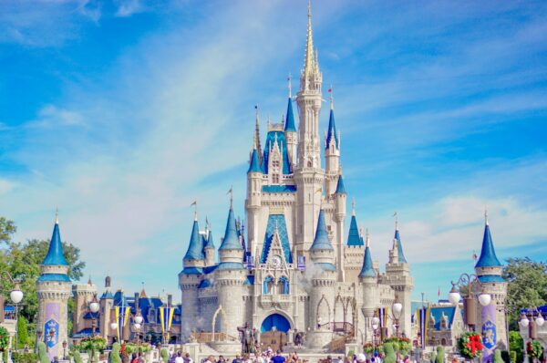
1985: The Introduction Of The Castle
In 1985, Disney introduced its first full castle animation logo, marking a major milestone in the company’s branding. Debuting with The Black Cauldron, this version featured a white silhouette of a fairy-tale castle, inspired by Neuschwanstein Castle in Bavaria, Germany. The castle is accompanied by an arc of light forming a star that traced over the structure. It was paired with the iconic “Walt Disney Pictures” script beneath it.
1986–2006: Sparkles, Castles, and Fairy Dust
From 1986 to 2006, the Disney logo featured a standardized version of the castle with the signature fairy-tale arc, solidifying its place as a timeless brand symbol.
This 2D logo, often rendered in blue and white, showcased a simplified silhouette of the castle with a shooting star drawing an arc overhead, representing Tinker Bell’s magic. The “Walt Disney Pictures” script sat below, reinforcing the company’s identity.
2006: Setting Sail with Disney’s First CGI Castle
In 2006, Disney unveiled a fully CGI-animated logo with the release of Pirates of the Caribbean: Dead Man’s Chest, marking a dramatic evolution in the studio’s visual identity.
This new logo featured a detailed, three-dimensional rendering of the castle, complete with towers, flags, fireworks, and a sweeping camera movement that gave it a grand, cinematic feel. The iconic arc of light remained, now integrated with the more immersive animation.
2006–2011: The Castle Takes Center Stage
From 2006 to 2011, the Disney logo continued to evolve with enhancements to the CGI castle introduced in Pirates of the Caribbean: Dead Man’s Chest. During this period, the logo became more intricate and cinematic, featuring a richly detailed castle inspired by a blend of real and fantasy architecture, including elements from Neuschwanstein Castle and Disney park icons.
2011–Present: The Icon That Keeps Evolving
The CGI castle introduced in 2006 remains but with refined updates. The “Walt Disney Pictures” text was shortened to simply “Disney,” reflecting the brand’s global recognition and streamlined identity.
2023–2024: Celebrating 100 Years of Disney Magic
In 2023–2024, to celebrate its 100th anniversary, Disney introduced special editions of its iconic logo under the “Disney100” banner.
These commemorative versions featured a redesigned CGI castle rendered in platinum tones, symbolizing the centennial milestone, along with sparkling visual effects and orchestral variations of classic Disney themes. Embedded within the sequence are subtle nods to decades of Disney’s legacy: landmarks and motifs from Pocahontas, Tangled, Brave, The Hunchback of Notre Dame, The Little Mermaid, theme-park icons like Pride Rock and Matterhorn, and even a Disneyland-style locomotive appear.
Logo Symbols
At the heart of the Disney logo is the iconic castle, inspired by Germany’s Neuschwanstein Castle, though it’s not an exact replica. While many assume it depicts Sleeping Beauty or Cinderella’s Castle, the design is actually a stylized version of a real building.
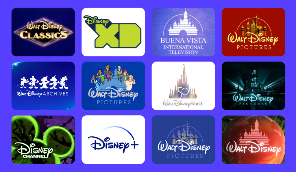
Logo Variations
For More Info: XpertLab
Related Blog: Gen Z Design