Sencha Touch
14th July 2023
What’s new for Apple developers
25th July 2023From its humble origins in Jeff Bezos’ garage to its place as the 2nd largest company in the world, Amazon’s rise to prominence is one of the most iconic stories of the Information Age. Equally iconic is the Amazon logo.
As the company has evolved, the Amazon logo has given us a unique visual record of its journey. Culminating in the design we all know and love today: the legendary Amazon Smile.
As far as famous brands go, Amazon is up there with the best of them. Let’s plunge into the Amazon logo story to uncover its history, symbolism, and meaning. We’ve included tips for your own iconic logo design along the way!
Amazon’s Early Beginnings
Long before Jeff Bezos shot himself into space wearing a cowboy hat and proclaimed it the ‘Best Day Ever,’ he was just a guy with a dream in a garage in Seattle (you can find the actual house Amazon was started in here).

In 1994, sensing the disruptive opportunities the internet would bring to retail, Bezos quit his New York hedge fund job and moved to Emerald City. There, he started an online bookstore. As one of the first sites of its kind, the company swiftly began outpacing its brick-and-mortar competitors.
Fun fact: Amazon was first incorporated as Cadabra Inc until a lawyer misheard the name as ‘Cadaver’ (lol). Bezos was not keen to be known as a company that sells dead bodies. So, he changed the name to Amazon, after the Amazon River, the largest river in the world. (Which is probably full of dead bodies, ironically).
Ultimately, the ‘Amazon’ name became central to the visual and conceptual power behind the company’s logo. Today, the iconic ‘Smile’ logo features an arrow starting at the letter A and ending at Z (from ‘A to Z’). It’s a motif that cleverly reflects Amazon’s endless range of products and end-to-end delivery.
The Evolution Of The Amazon Logo

Amazon’s logo has undergone several redesigns throughout its history. These logo redesigns reflect the company’s evolution.
Here’s a quick overview of the major logo redesigns in Amazon’s history. We’ll also review how other branding elements evolved as the company has changed.
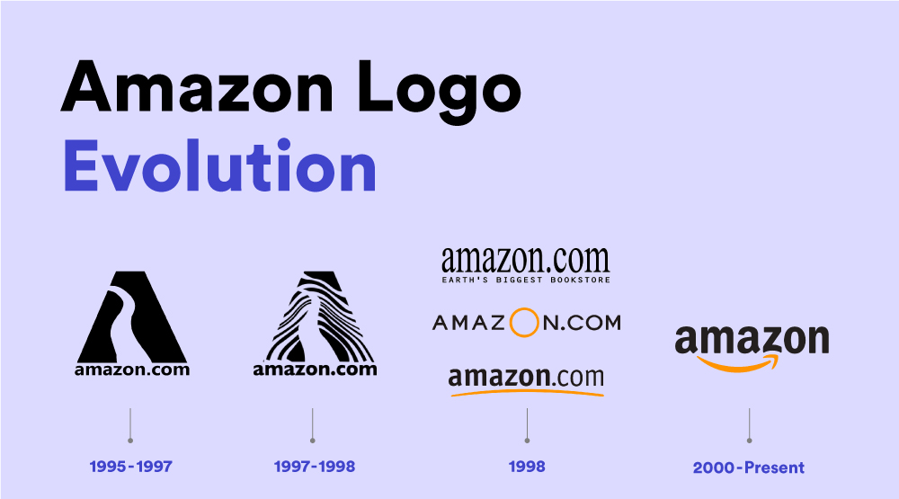
Amazon’s Original Logo (1995-1997)
The original Amazon logo was designed by the agency Turner Duckworth, in 1995. (The same agency would go on to design today’s logo, too.)

Looking back at the original logo, it’s a deceptively simple design. Sure, it’s a little dated in terms of its execution. But Amazon’s original logo does adhere to some important concepts of effective logo design. As a testament to this, many of the original design elements of the Amazon brand have persisted today.

First, the original Amazon logo featured a straightforward font with the full website name ‘amazon.com.’ This was a savvy move for an early internet company looking to familiarize people with its URL.
More importantly, it’s also easy to see how Amazon’s modern, lowercase wordmark can be traced back to the first logo, which stylistically resembles the 2023 version.
Finally, the A in the original logo features an image of the Amazon River as the logo’s negative space. A hint at the play with shapes and letters persisting in Amazon’s current logo.
So while the first design was a little clunky by today’s standards, it still stands as an effective, recognizable logo (and was miles better than Apple’s first logo!)
Zebra Print Logo (1997-1998)

It’s no coincidence that the first Amazon logo redesign came out roughly the same time as A Night at the Roxbury (1998). The first logo redesign features the same garish of late 90s stylings and ridiculousness. Out of nowhere, we get a zebra print effect that seems so unnecessary, it’s almost brilliant.
Luckily, the ‘97 logo was only in use for a year.
Amazon’s 1998 Logos

Three more logos were created in 1998, a time in which the company evolved significantly and it was challenged with developing its core brand identity.
Although each of the ‘98 logos was, in isolation, a failure, each one contained elements that informed the logo’s later development as a whole.
- The first of the ‘98 logos eliminated the monolithic A letter, opting for a serif typeface and the logo tagline ‘Earth’s Biggest Bookstore’. And yeah, it kind of sucked.
- The second ‘98 logo ditched the tagline and introduced the classic Amazon yellowy-orange colour. But still, it kind of sucked.
- The final ‘98 logo, which lasted until 2000 and sucked slightly less, was the first to tie these developing elements into something resembling today’s Amazon logo. In it, we see the bold, sort-of sans-serif font, and the orange line beneath the wordmark
The Smile Logo (2000 – Present)
Amazon’s breakthrough logo was developed in 2000 by the design agency Turner Duckworth (check out the famous case study for Amazon’s logo).

In it, we see all the elements of the previous logos coming together. The curvy orange line remains a core part of the Amazon emblem, now stylized to resemble the famous smile.
The typography remains consistent with the previous iteration. Here, we get a streamlined, modern font (Officina sans bold) and the removal of the full website name. The smile has become a core part of Amazon’s marketing vehicle and is even recognizable in isolation on the company’s shipping boxes.
Let’s take a look at some additional logos of the Amazon brand.
AWS

The AWS logo works in the signature curved arrow from the main Amazon logo, emphasizing the connection and integration between the two entities.
Amazon Prime

The company’s subscription service for shipping and streaming retains the core elements of the primary Amazon logo with significant changes. Primarily, the replacement of Amazon with the word “Prime” and the distinctive Prime blue color. The smile icon remains, showing us how powerful it is as a brand symbol.
Amazon ads

An example of one of the simpler subsidiary logo executions, the Amazon ads logo features the original logo with the word ‘ads’ shortly after in a lighter-weight font.
Amazon Music

Another example of a simpler logo addition, Amazon music follows the previous pattern but includes a unique font color for the lighter weight font style.
Amazon Studios

The Amazon Studios logo is the most noticeable deviation from the original logo. It has a more cinematic design through a white logo font on a black background and all-caps text.
Related Blog: https://xpertlab.com/behind-the-scenes-international-keyboard-shortcuts/
For More Info Visit: xpertlab.com


