
Unique Features of React.js: Why It’s a Game Changer for Web Development
15th October 2024
Sequelize VS Prisma
28th October 2024
In mobile app design, every element contributes to the overall user experience, but typography often takes a back seat to layout or color schemes. However, the right font choices can make or break an app’s usability, directly impacting readability, aesthetics, and even user retention. In this blog, we’ll explore the role typography plays in mobile app usability and offer guidelines for selecting fonts that enhance both function and form.
The Role of Typography in Usability
When users interact with a mobile app, their experience is shaped not just by visuals but also by how easily they can read and interpret the content. Typography serves two crucial roles in usability:
Readability: If users struggle to read the text, they’ll quickly grow frustrated and abandon the app. Font size, line spacing, and character clarity all influence how comfortable it is to read.
Visual Hierarchy: Typography also dictates the flow of information. Different font weights, sizes, and styles help users distinguish between headings, subheadings, and body text, guiding them through the app with ease.
Aesthetic Appeal: Beyond Functionality
While typography needs to be functional, it also plays a significant role in the app’s aesthetics. The right font can convey brand personality and tone. For instance, a bold, modern sans-serif font like Helvetica can give off a sleek, professional vibe, while a playful script font might be better suited for a lifestyle or creative app.
How Font Choices Impact Mobile App Usability
Screen Size Considerations: Mobile screens are inherently smaller than desktops, making font size a critical factor. Too small, and users will squint or zoom in. Too large, and the text may take up too much space, leaving little room for other content.
Legibility in Different Environments: Mobile users are often on the go, using their phones in varying light conditions. Choosing fonts with good legibility ensures readability whether users are indoors, outdoors, or in low-light situations.
System Fonts vs. Custom Fonts: Using system fonts like Roboto (for Android) or San Francisco (for iOS) is often a safe bet. These fonts are optimized for mobile screens and typically provide better performance. However, custom fonts can offer a unique brand identity if used carefully to avoid performance lags.
Guidelines for Selecting Fonts for Mobile Apps
Prioritize Legibility: Opt for fonts that are easy to read across different screen sizes and resolutions. Fonts with simple, clean lines (like sans-serif fonts) tend to be more legible on smaller screens.
Use Appropriate Font Sizes: The general rule of thumb is to use at least 16px for body text. Anything smaller may strain the eyes, especially on devices with high pixel densities.
Create a Clear Hierarchy: Establish a visual hierarchy by using different font sizes, weights, and styles to differentiate headings, subheadings, and body text. Consistent usage of font sizes will also make your app more intuitive.
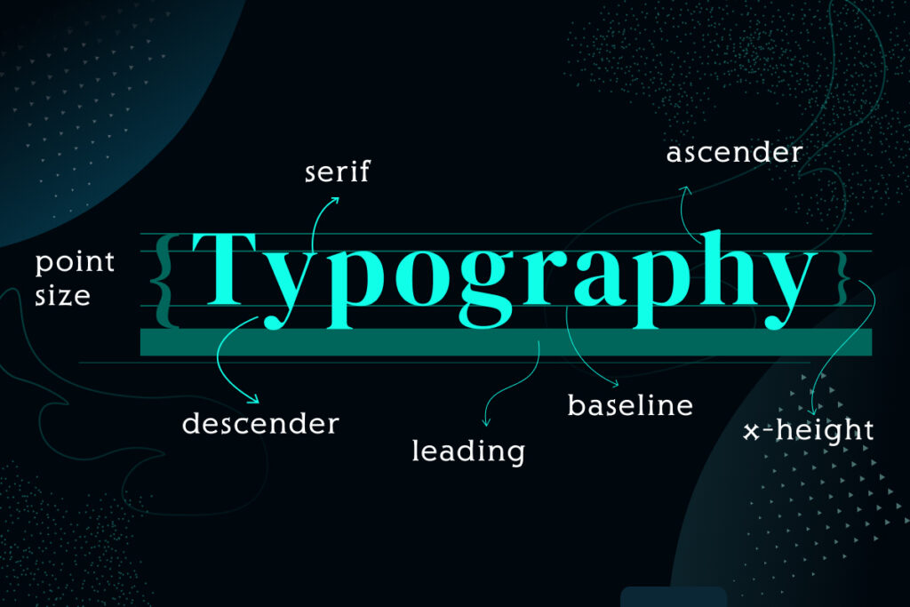
Consider Line Spacing and Letter Spacing: Good line spacing (also known as leading) makes paragraphs easier to read. A comfortable range is between 1.2 to 1.5 times the font size. Likewise, adjusting the letter spacing (tracking) can prevent text from feeling too cramped or too spread out.
Test for Performance: Custom fonts can slow down your app’s performance, especially if they’re not optimized for mobile. Always test the load times and rendering of custom fonts across different devices.
Stick to a Limited Number of Fonts: Too many font types can clutter the app’s design and confuse the user. Stick to one or two complementary fonts for a cohesive look.
Ensure Accessibility: Choose fonts that support multiple languages and consider accessibility standards. Ensure sufficient contrast between text and background, and avoid overly decorative fonts that might hinder readability for users with visual impairments.
For More Info: XpertLab
Related Blog: Storytelling in Design