Every Setback is a Setup for a Comeback
21st March 2025
Getting Started with Lynx: A Next-Gen Cross-Platform Framework
12th April 2025Typography Tips: How to Choose the Right Font for Your Brand
Typography is more than just choosing a pretty font—it’s a silent brand ambassador. The fonts you select influence how your audience perceives your brand, impacting everything from readability to emotional response. Whether you’re creating a logo, website, packaging, or social media post, your typography should speak the same language as your brand.
In this blog, we’ll walk through practical tips for choosing the right font for your brand, along with examples and insights to help you make a confident choice.

1. Understand Your Brand Personality
Before you even browse font libraries, take a moment to define your brand’s personality. Is your brand playful, elegant, bold, tech-savvy, or minimalist?
Here’s a quick font style guide based on personality types:
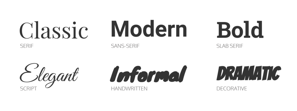
| Brand Personality | Font Style Suggestion |
|---|
| Modern & Clean | Sans-serif (e.g., Helvetica, Lato) |
| Elegant & Luxurious | Serif (e.g., Baskerville, Playfair Display) |
| Playful & Creative | Handwritten or Decorative (e.g., Pacifico, Lobster) |
| Bold & Strong | Slab Serif or Heavy Sans (e.g., Rockwell, Bebas Neue) |
| Techy & Futuristic | Geometric Sans (e.g., Eurostile, Orbitron) |
2. Prioritize Readability
No matter how beautiful a font is, if it’s not legible, it fails. Readability is especially important for body text, menus, or product labels.
Tips for better readability:
- Avoid script or display fonts for long paragraphs.
- Stick to 2-3 font families per brand to avoid visual chaos.
- Use enough contrast between the text and the background.
- Test your fonts on different screen sizes and formats.
3. Consider Font Pairing
Great typography often involves more than one font. The key is contrast with harmony.
A good pairing usually includes:
- A serif + a sans-serif
- A bold heading + a light body font
- A decorative font for accents + a clean font for content
Examples:
- Montserrat (heading) + Open Sans (body)
- Playfair Display (heading) + Roboto (body)
- Raleway (heading) + Lora (body)
Pro tip: Use Google Fonts or tools like Fontpair to find winning combinations.

4. Think Long-Term Consistency
Typography should be part of your brand identity guidelines. Use the same fonts across all materials—from business cards to websites to Instagram stories.
Ask yourself:
- Does this font still align with where I want the brand to be in 5 years?
- Will it grow with the brand as I expand into new products or services?
5. Avoid Overused or Trendy Fonts
Some fonts (like Comic Sans or Papyrus) are overused or carry unintended connotations. While trendy fonts can be tempting, they can also date your brand quickly.
Instead:
- Opt for timeless, versatile fonts.
- Customize or slightly tweak fonts to make them feel unique.
- If possible, invest in a professional typeface or hire a typographer.

More Info: XpertLab
Related Blog: The Psychology of Color in UI Design


