CSS tricks to shake up your web layouts
26th March 2021
What Is SharePoint?
27th March 2021Your website is one of the most important aspects of your brand’s online presence and it’s important that you design it right. Your website is also the place where you nurture your bottom-of-the-funnel leads to get conversions. So, you can’t afford any website fails that might cause your prospects to bounce off your website.
Your website should be designed keeping in mind your audience and should ensure that it provides good user experience. There are a lot of other benefits of a good website design for both your business and your audience.
In this post, we will discuss why good website design is important from your audience’s perspective.
Brand image
Your website is a reflection of your brand and everything that it stands for. It is usually one of the first things people look at to get to know a brand and therefore helps form the first impression.
Your website design elements, like colours, fonts, images, etc. all form your brand identity. Therefore, you need to select those elements carefully and keep them consistent across your website.
Look at the screenshot of Coca Cola’s homepage, for example.
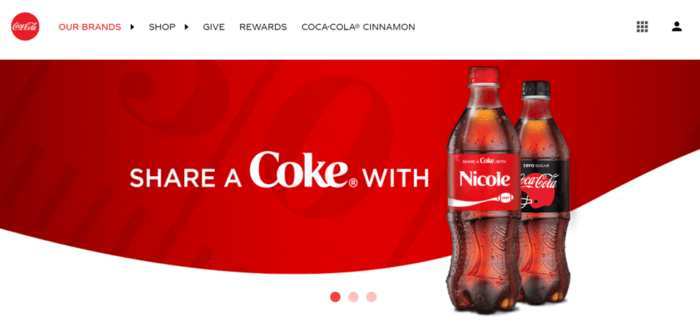
See how the brand has used the company’s distinctive red colour on a white background. Red and white are the colours of the company’s logo, packaging of their traditional coke bottles, and a lot of other brand elements. It maintains this consistency because these two distinctive colours represent the brand and people associate these with the company.
Here are some of the web design elements that you should select carefully and then use consistently.
Colour
If you already have some brand colours that align with your logo and other brand identity elements, then you should use those on your website as well. However, if you’re starting from scratch, then you can use this study to understand colour associations.
For example, if you want to associate your brand with trust, then you should use the colour blue. And, if you want consumers to think that your brand produces high-quality products, then the colour black can help you form that image. Similarly, depending on what brand associations you want to form, you can select your brand colours.
You can then select colours that evoke certain emotions or thoughts in people. For example, blue is the colour most associated with trust and black with quality.
Layout
As a rule of thumb, keep your layout simple, clean, and designed in a way that draws attention to the most important parts.
Also, the number of menu options or the elements in a drop-down menu should be determined based on your audience preferences. You can experiment with a few different layouts and conduct split testing to understand what works best with your audience.
One of the best examples of cluttered website design and how it affects usability is shown below. The website is very difficult to navigate and the lack of a grid design makes it messy and chaotic.
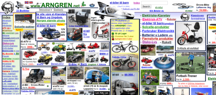
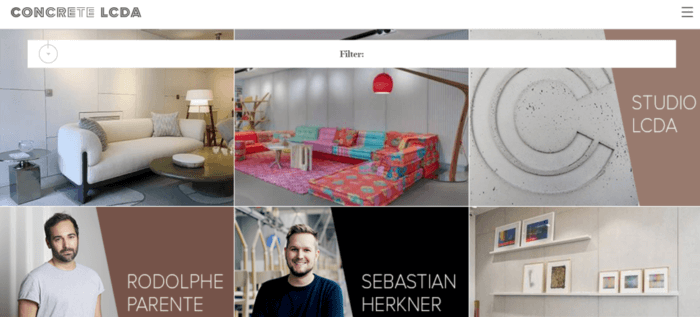
Now, let’s compare it with another website with a cleaner layout to see how it could have been structured instead. This website also focuses on the products and services but has organized the various web elements well. The use of a grid format further adds structure to the page.
Fonts and typography
The general rule for selecting a font is that it should be easy-to-read and clearly visible on the background colour that you selected.
The actual selection, however, should depend on your audience. Younger people, for example, often prefer more fun and stylish fonts. Older people might prefer clean and simple ones that are easier to read.
Your font should also reflect your brand personality and whether you want to look professional or fun and youthful.
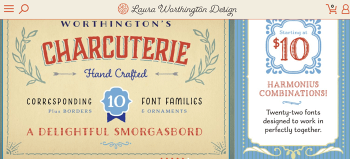
Here’s an example of a brand that does this well by their use of a creative font to reflect their own creativity.
Website accessibility
You should design your website in a way that makes it accessible to all. It will not only make the experience better for your audience but is also required by law. This means designing your website so that people with disabilities can also access it.
This is, however, easier said than done. Most website designers and agencies are not even aware of this, let alone able to design an accessible website.
So, whether you build your website yourself or use a web design agency, make sure that you design an accessible website. While this can be extremely challenging, you can make the most of solutions like accessiBe to simplify the whole process. The company provides you with a code, which you can install so your website will instantly display an accessible interface.
The accessible AI also scans and analyzes your website to ensure that it complies with all accessibility-related laws (ADA, WCAG, Section 508) in just 48 hours. This will help you avoid any accessibility-related lawsuits, (yes that’s a thing), and include a larger number of people in your audience.
Site navigation
One of the biggest benefits of a good website design for your audience is that it can help them navigate the site easily.
The ultimate goal of anyone visiting your website is to quickly find the information that they are looking for. And, your website design should make that process easier and help visitors navigate your website without getting lost.
The more user-friendly your website is, the more likely it is that people will engage with your content and take the desired action. A good website design should aim to provide the best user experience, which ultimately translates into conversions.
Airbnb, for example, has a very simple, yet engaging website design where you can find everything right from the homepage. Whether you want to make a booking or explore the different types of accommodations and experiences provided by Airbnb, you will find an option on the homepage.
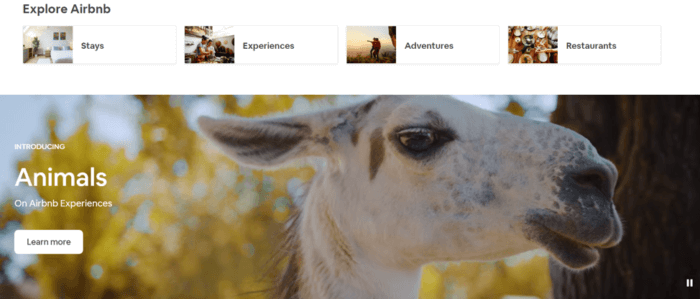
As you scroll down the page, you will find more options to explore. From top-rated Airbnb stays to travel recommendations, you have it all.
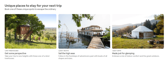
So, if you know where you want to go, you can simply make a booking from the top of the page. If you’re just exploring your options, you can simply browse through and get inspiration for your next trip.
See how brilliant that strategy is? Airbnb does not just make it easy for people to book stays but also encourages them to plan a trip if they’re not yet sure.
And, all of that can be done right from the homepage. No messy drop-down menus, no page hierarchies, just a clean and simple all-you-need-to-know-you-find-it-here kind of design.
Conclusion
Website design is an important matter and should not be taken lightly. A well-designed website can help you form a good impression on your prospective customers. It can also help you nurture your leads and get more conversions.
But, more importantly, it provides good user experience and helps your website visitors access and navigate your website with ease.
So, if you are looking for designers to create your website, vet them well and ensure that they are capable of designing user-friendly and accessible websites.
If you already have a website, you can always conduct a site audit and optimize it to provide a better user experience and to improve accessibility.


