n8n: The Ultimate Open-Source Automation Tool for Your Business
22nd November 2025
The “Anchor Mindset”: Becoming the Most Stable Person in an Unstable Moment
27th November 2025
Ever looked at a competitor’s website, business card, or social media post and thought, “Wow, that looks so professional!” while your own designs feel… not quite there? The difference often isn’t fancy graphics or expensive photography; it’s understanding visual hierarchy.

Visual hierarchy: The secret to designs that just “work”
Think of visual hierarchy as your design’s GPS—it guides your audience’s eyes exactly where you want them to go. When you’re juggling all the pieces of your business, having designs that effectively communicate your message isn’t just nice to have – it’s essential for success.
Why nailing visual hierarchy matters to your business
Real talk: Your potential customers are bombarded with thousands of visual messages every day. They’re scrolling quickly, making snap judgments, and deciding whether your business deserves their attention or money in just seconds. Good visual hierarchy isn’t just a design nicety—it’s your secret weapon for earning that precious attention. Here’s what it does for your business:
1. Stand out in a crowded market
When potential customers see dozens (or hundreds) of similar businesses, proper visual hierarchy helps your brand rise above the noise with designs that command attention and communicate professionalism.
2. Look professional from day one
Even if you’re just starting out, strategic design choices make your business appear established and trustworthy. Visual hierarchy creates the polished look that customers associate with successful businesses.
3. Get your message across quickly
Today’s consumers have shorter attention spans than ever. Visual hierarchy ensures they grasp your most important points even if they only glance at your materials for a few seconds.
4. Build trust with potential customers
Organized, thoughtfully designed materials signal to customers that you’re detail-oriented and professional in all aspects of your business—not just your design.
5. Save time and reduce design frustration
With basic visual hierarchy principles in your toolkit, you’ll make better design decisions faster and feel more confident in your creative choices.
Working with (not against) how your customers actually see
No matter how beautiful your brand elements are individually, they need to align with how people naturally process visual information. Understanding these patterns helps you position your logo, colors, typography, and imagery where they’ll have maximum impact.
When someone encounters your business materials, their eyes move in predictable ways:
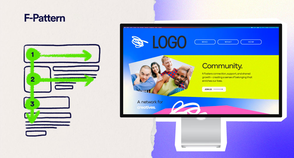
The F-pattern
The F-Pattern dominates text-heavy content like blog posts or service pages. Eyes scan across the top, then partially across the middle, then quickly down the left side. This is why your most distinctive brand elements and key messages belong at the top and beginning of paragraphs.
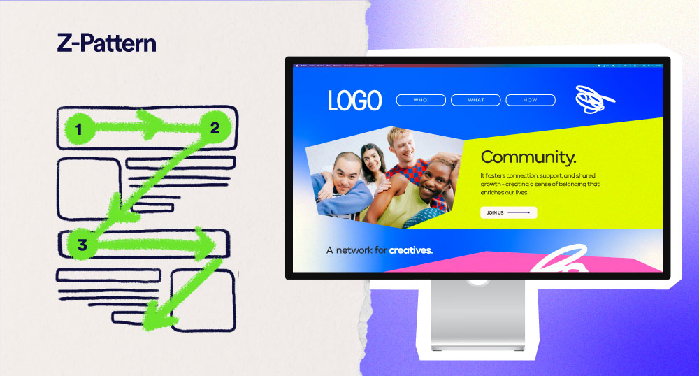
The Z-pattern
The Z-Pattern takes over in more visual designs with less text (like ads or social posts). Vision moves across the top, diagonally down to the opposite side, then across the bottom. Smart designers place their logo in the top left and call-to-action in the bottom right to leverage this natural movement.
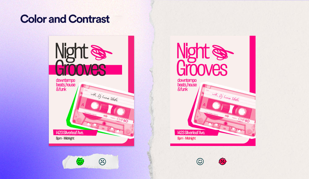
2. Color and contrast
Let’s be clear: Color isn’t just decorative—it’s strategic. Our eyes are naturally drawn to bright colors and strong contrast before anything else in a design. These elements create visual interest that pulls viewers in and directs their attention precisely where you want it. Think about how a yellow sale tag pops against a black background, or how a red “New” label jumps out on a product page.
The trick is understanding when to dial it up and when to tone it down. Ask yourself: What element should be noticed first? What information can hang back as supporting content?
- On a billboard, your brand color might frame a bold headline in high contrast
- For an email newsletter, use color sparingly to highlight just the links or buttons you want clicked
- In a business presentation, save your brightest color for your key data points or conclusion slide
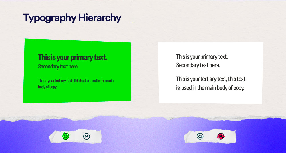
3. Typography hierarchy
Typography isn’t just about picking pretty fonts—it’s about creating distinct levels of information. Think about a newspaper: you instantly know what’s most important (headlines), somewhat important (subheadings), and supporting details (body text).
Your brand likely already has 1-3 fonts. The key is using them in a structured way that signals to readers, “read this first, then this, then this” across all your materials. For instance:
- Your website might use your bold font for main page titles, medium weight for section heads, and regular weight for paragraph text
- Your presentation slides might use large type for single key points and smaller type for explanatory details
- Your brochure might use different fonts for testimonials versus product descriptions
Related Blog: Dark Mode Evolution
For More Info: XpertLab