Light Fidelity
18th February 2021
Flutter Vs React Native Vs Xamarin – Top Cross-Platform Mobile App Development Frameworks
20th February 2021The Complexity Of Simplicity
Fast forward ten years into the hectic digital world we live in and the situation has only become exacerbated. Simple design is increasingly difficult due to consumer desire for integrated software, big data and the internet of things amongst others – these all lead to more user touch points and more things to consider. The more things there are to consider, the harder it can be to keep things simple, and yet the greater the need to keep things simple is!

What Are The Arguments For Keeping Things Simple?
There are many reasons why you, as a UX designer, would want to keep it simple:
1. People have much shorter attention spans today
Google allows us to have instant access to billions of sites so we want everything quicker and won’t accept slow sites which take longer to load. Etsy did an experiment with this- they added 160kb of hidden images to their mobile page to slow it right down. They saw a 12% increase in bounce rate. This mean designs need to be as intuitive as possible so users don’t feel overloaded and also so the page loads quickly.
2. Simple is more convenient for the user
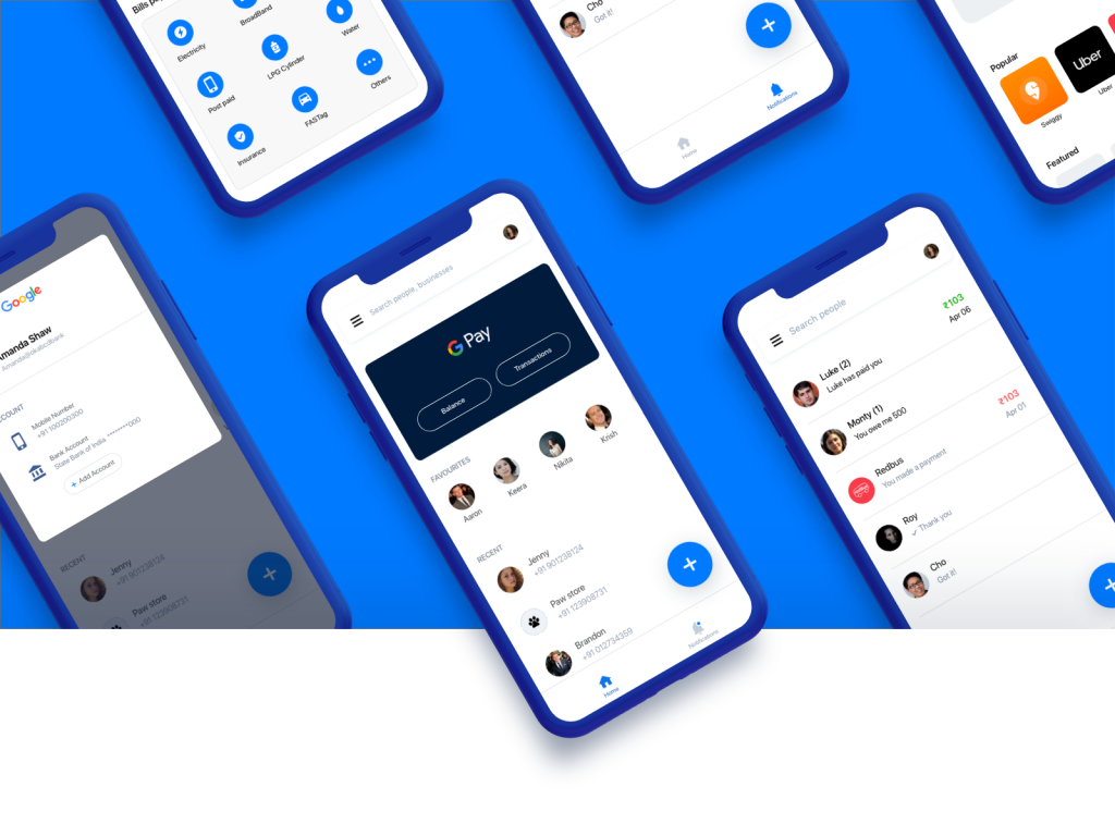
UX guru, Paul Boag says users are ruthlessly obsessed with doing whatever they need to as quickly as possible by choosing the ‘path of least resistance’. He says products that are as simple as possible will have a competitive advantage as users can dip in and out of them. He gives Uber as an example of a company who have kept a simple design, not bothered to wow the users but have captured them in droves due to simplifying what can be a drawn out process. Pre-Uber people had to hail a taxi, make sure they had cash on them, hope that the driver had GPS and then sit and wait for their change at the end of the ride. This process has now been entirely automated which is far more convenient for everyone involved.
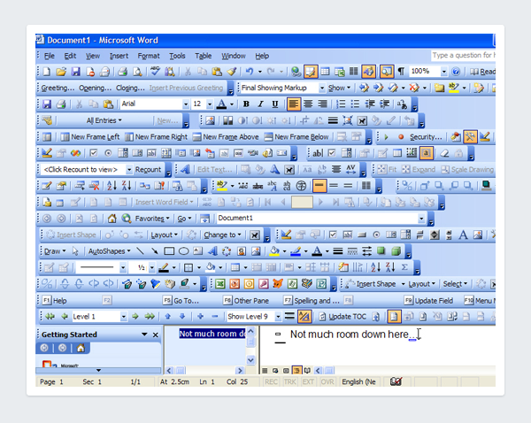
3. Complicated products are likely to have more feature creeps
This is where more and more features keep getting added on to a product without them being properly thought out. When this happens the original value of the product is lost and the user is completely confused by the number of options. A famous example of this is this Microsoft Word screenshot:
4. Simple is often more enjoyable
One area where this is particularly apparent is when completing an online web form. Going back ten years web forms were often extremely taxing to fill in and lacked the visual prompts we are now used to today. The user often didn’t know they had missed a field until they had already selected ‘complete form’. These days features such as anticipatory design, single-field and natural language form interfaces and an increase in visual prompts can make filling in forms almost fun!
Against Simplicity
And why might you not want to keep it simple?
- Simple is not necessarily easy to use
Don Norman, one of the founders of the Nielsen-Norman Group who wrote the definition of UX above, says that simple can be overrated because something which is simple is not necessarily easy to use. He gives the example of a piano:
‘The piano is too complex because it has 88 keys and three pedals? Should we simplify it? Surely no piece of music uses all of those keys. The cry for simplicity misses the point’.
- Sometimes more features are needed
UXmag gives an example of a mobile phone: it would be simpler without a camera but would users actually want it? Probably not based on figures from Statistca who reported that 36% of the world’s population will have a smartphone by 2019 – this is a 26% jump from 2011. - Simple is not always the best way to engage the user
In this UX podcast, James Royal-Lawson and Per Axbom critique Paul Boag’s pro-simplicity article came to the conclusion that there is much more to UX than just simplifying. UX is about understanding users and what they are trying to achieve. People aren’t always rational – they are emotional.
Sometimes users are actually more likely to respond to something that resonates them, makes them curious or makes them laugh rather than just the simplest product. This is why a lot of emotive or aspirational imagery is often used by global brands such as Nike.
- Over-simplified products sometimes provide poor user experiences
It is possible to over-simplify a product. This can be particularly common on mobile apps where features that are available on the desktop site have been massively cut. People nowadays expect to do everything they can on a desktop site on their phones and if they can’t they think it is a poor user experience. It is also easy to over-simplify copy so that users don’t actually understand what they are supposed to do. An example of this but would reducing an error message to a few words. Visually it would look better but users would not know what the problem is or how to solve it.


