Django: 10 Common Anti-Patterns to Avoid 🦄
18th November 2023
Jenkins: Acceleration Of Software Development
1st December 2023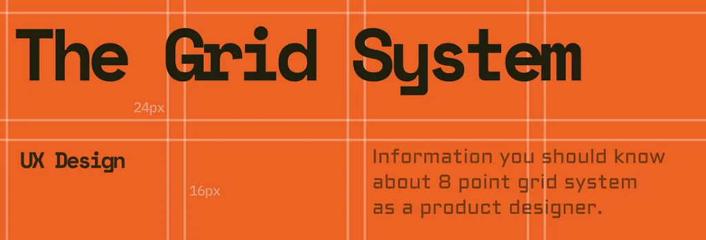
If you are a product designer or User Experience Designer then maybe you’ve probably heard the term grid system. In this article, I will discuss about using the most commonly used 8-point Layout Grid Systems. Consistent and scalable spacing helps both the designer and developer to work much faster on a project.
Why use 8 point Grid system?
Website, apps, dashboard, UI, etc. there is a variety of screen sizes. Pixel densities have continued to increase making the work of asset generation more complicated for designers. Utilizing numbers like 8 to size and space elements makes scaling for a wide variety of devices easy and consistent. Also, the majority of popular screen sizes are divisible by 8 which makes for an easy fit. The principle of 8pt Grid is that use multiples of 8 (8, 16, 24, 32, 40, 48, 56, etc.) to layout, dimensions, padding, and margin of elements.
The value of 8 point grid system
- It provides a visual hierarchy of elements and drives consistent scalability with fewer decisions to make while maintaining a quality rhythm. When designing the UI looks clean, better, and beautiful.
- The best system of communication between designers and developers. A developer can easily understand and eyeball 8pt increments instead of having to measure each time.
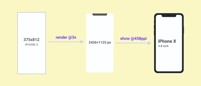
Point (pt) is a measurement of space that is dependent on screen resolution. When we start UI design we use small artboard (375×812 for iPhone X) but the real device screen resolution is huge (1125×2436 or 5.8inch for iPhone x). It happens because in iPhone X the artboard is rendered at 3 times (@3x) as much since it has a Super Retina display that has 3 times as much PPI ( Pixel per Inch).
The hard and soft grid method
Hard and soft grids both are a part of the grid system but there is some difference between them.
Setup a Layout system using 8 point grid and Bootstrap
If you are designing for the web then you must do responsive design (web pages that look good on all devices). Also, when designing for mobile you have to make sure it will fit all devices. That’s why it’s important to set up a layout system (8 points + Bootstrap). At first, for Horizontal Rhythm/grid use a standard bootstrap grid system of 12 12-column layout with a gutter width of 24px (1.5rem). If you took an artboard of 1440px (Desktop size) then use a 60px margin on each side of the container.
Spacing system between elements and 8-point grid
Spacing is very important in UI design because it makes the design neat and clean. UI looks logical (developers friendly), attractive and beautiful. Use principles of 8 point: 8px / 16px / 24px / 32px / 40px / 48px / 56px and so on for all padding and margin between elements (sometimes you can use 4px if you need to go in tight).
Iconography and 8 points grid
When you are designing make sure you use SVG format. If you intend on using or designing icons then use multiples of 8 (16×16, 24×24, 32×32, 40×40, etc). It will easily fit within the layout system.
Typography and 8 points grid
8pt Grid on typography gives a much more harmonious vertical rhythm throughout designs. To create a consistent typography system fast sometimes I use this web tool.
Font size may vary from device to device, It could be 14px, 15px, 21px, etc but it’s important the line height will not. Line height should be a multiplication of 8 (8, 16, 24, 32 …) but if you want then you can use a multiplication of 4 (4, 8, 12, 16, 20, 24…). I personally use a multiplication of 4 for line height because it gives more fine-grained control and brings much better results.
Conclusion
Remember you don’t have to follow this grid system strictly (100%). We’re designers, not robots 👽 and we should be flexible. So, if a component is not multiplied by 8 but the design looks good just use it, and break the rule. One more thing, when you are working on a project then share the system with the developers and help them understand the benefits.