
React Hooks
6th March 2025
Meeting European Accessibility Act (EAA) Standards: A Developer’s Checklist
8th March 2025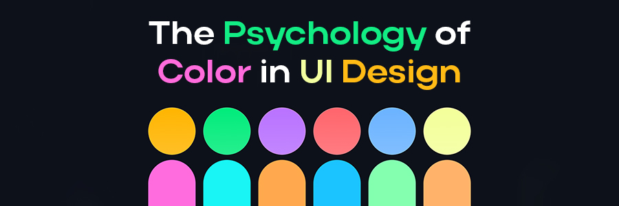
Color is one of the most powerful tools in user interface (UI) design, influencing user emotions, perceptions, and interactions. Thoughtful color choices can enhance usability, improve engagement, and create a memorable experience. Understanding the psychology of color helps designers craft interfaces that resonate with users on a deeper level.
The Emotional Impact of Colors
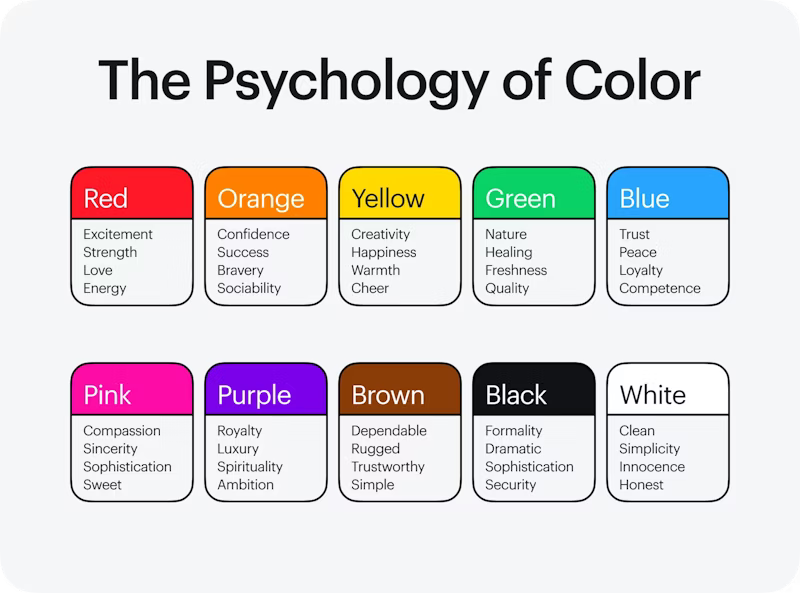
Different colors evoke different psychological and emotional responses. Here’s how some common colors affect users:
- Blue – Represents trust, security, and professionalism. Frequently used in financial, healthcare, and tech industries.
- Red – Evokes urgency, passion, and excitement. Often used for calls to action and attention-grabbing elements.
- Green – Associated with nature, health, and tranquility. Works well for wellness, sustainability, and financial apps.
- Yellow – Represents optimism, warmth, and energy. Used to create a cheerful and welcoming atmosphere.
- Black – Conveys luxury, sophistication, and power. Commonly seen in high-end branding and minimalist designs.
- White – Symbolizes simplicity, purity, and clarity. Often used to enhance readability and create a clean.
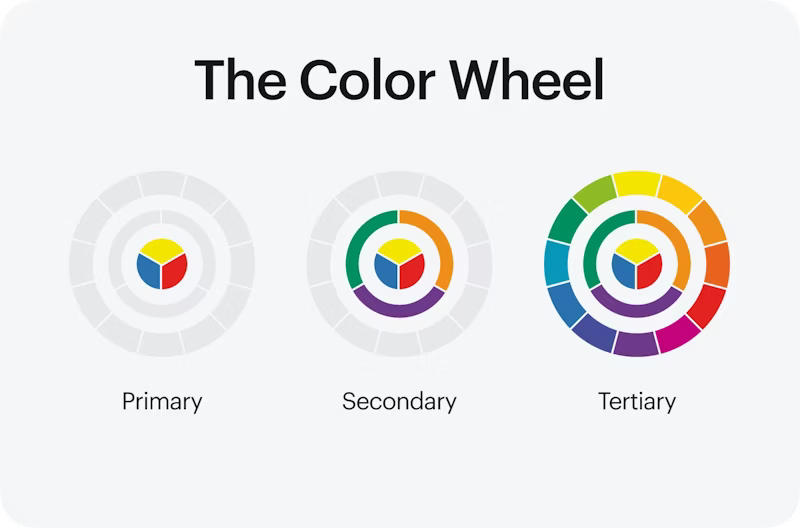
The Color Wheel
The color wheel is a valuable tool for UI/UX designers as it helps distinguish colors and allows one to look at them collectively. This helps select the right colors and combinations when working on a design.
There are several different types of color wheels. For example, the RGB (red, blue, green) color wheel and the CMYK (cyan, magenta, yellow, and key or black) color wheel. However, this section refers to the color wheel based on the primary, secondary, and tertiary colors.
Color and User Behavior
Color choices can guide user behavior and decision-making in digital interfaces:
- Calls to Action (CTA): Bright, contrasting colors like red or orange draw attention and encourage user interaction.
- Navigation & Readability: High contrast between text and background improves readability and usability.
- Brand Recognition: Consistent color schemes build brand identity and make interfaces more recognizable.
- Accessibility: Color contrast and combinations should be chosen carefully to ensure usability for all users, including those with visual impairments.
Creating Effective UI Color Palettes
To design an effective color scheme, consider these principles:
- Establish a Primary Color – Choose a dominant color that reflects the brand’s personality.
- Use Complementary Colors – Supporting colors should enhance the primary color and maintain balance.
- Limit the Palette – A simple, well-coordinated color scheme (typically 3-5 colors) ensures visual consistency.
- Consider Cultural Differences – Colors may have different meanings across cultures, so understanding the target audience is crucial.
- Test & Iterate – Conduct A/B testing to determine how different colors impact user engagement and conversions

Conclusion
The psychology of color in UI design is a crucial aspect of creating intuitive, emotionally engaging, and effective digital experiences. By strategically using colors, designers can guide user interactions, enhance brand perception, and improve usability. A well-thought-out color palette not only makes a UI visually appealing but also strengthens user engagement and satisfaction.
For More Info: xpertlab
Related Blog: Top Font Trends of 2025