


Difference Between Native vs Hybrid Android App Development
30th January 2015
What Is A Logo And Why Do We Need It?
4th February 2015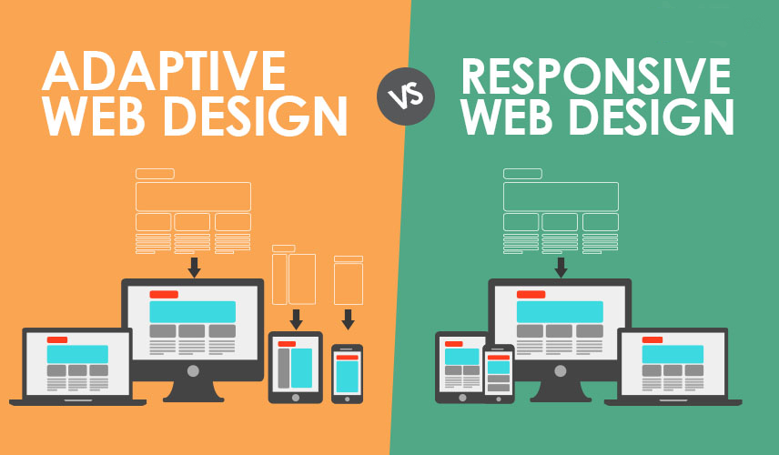
No doubts! Among all the web developers, Website Accessibility is one of the hottest topics which is being talked about. All the website owners are now more concerned about the accessibility of their websites on the screen of mobile devices rather than on PCs or laptops. This is one of the major growing concerns among the web developers which eventually gave rise to Responsive Web Design. With the rapid growing pace of tablets and smartphones in the market, it becomes quite compulsory for each and every website owner to ensure that their website must be compatible as well as responsive with all the devices in-built with internet.
XpertLab -Adaptive-vs-Responsive-Web-Design
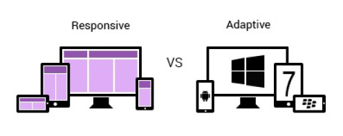
When it comes in for choosing the one out of Adaptive and Responsive web design, we start coming out with the differences between the two. Despite looking similar and even with same functions, what makes them separate?
Adaptive Web Design (AWD)
This web design uses the server for detecting the particular device which is being used for viewing the website. In simple words, we can say that this web design manage in determining that whether a website is viewed thru a smartphone, tablet or PC. For each of the devices, separate templates have been maintained and even the web pages on the websites which are designed using adaptive web design loads faster.
Responsive Web Design (RWD)
This web design manages to utilize particular CSS code for modifying the presentation of the websites which may vary according to the devices being used. Information associated with the device is downloaded irrespective of their use or not. The websites which are being designed using responsive web design are loaded with slow speed.
Difference between the Two
- The major difference between the two is that the adaptive web design will manage to thoroughly change in order to fit any screen size as well as the dimensions of the device and on the other hand, the responsive web design smoothly responds and change according to the device and screen size.
- AWD anticipates the web developer in developing as well as maintaining multiple websites either by using multiple HTML/CSS code or URL. On the other hand, RWD ambles on Javascript or HTML/CSS3 which is already existing and saves the developer from hassles of maintaining multiple CSSs/HTML or URLs.
- While making a single change in websites designed with AWD, the developers need to redo linking as well as content and SEO for the whole site. On the other hand, making single change in websites designed using RWD is as simple as learning ABC because it carries over all the settings over with it.
- AWD supports on the screen sizes which are predefined while RWD supports the fluid and flexible grids. In simple words, RWD needs more implementation as well as coding strategies in order to fit particular web pages according to varying screen sizes while AWD has already in-built streamlined approach which helps the web pages in utilizing the scripting in order to fit on to various screen sizes.
- For using AWD in designing websites, one need to have an advanced knowledge of CSS as well as Javascript while on the other hand, for using RWD in designing websites, one only need to have knowledge about changing the codes which are already existing.
- The websites which are designed using AWD have optimized images according to the screen resolutions while the websites which are designed using RWD have the downloaded as well as re-sized images.
Verdict
One of the hottest skills Web Design is evolving with a rapid pace in the market. No matter what you choose because planning and implementing a strategy behind the site designing is of utmost importance for mobile constraints. The developers need to assure about the optimized site’s content regardless of the type of device. All in all, your website must be dedicated and stands out well in front of the crowd or its readers. But knowing everything which we discussed above can be really fruitful for aspiring web designers.


