


SEO MISTAKES YOU NEED TO AVOID AND/OR FIX
5th January 2021
MEAN VS MERN STACK
7th January 2021
Even though XCode provides drag and drop UI development platform, there are lots of complications and ups and downs to deal with. Responsive UI has always been an integral part of user experience. Consistency in looks is very much important in any application. So, if you have been developing iOS apps, how are you managing to tackle this scenario?
I have been into native iOS development for couple of years now and I am going to share you my experience of handling adaptive or responsive IOS design. In web, if we have to design a responsive UI, first thing that hits our mind is percentage layout, right? That’s what hit my mind when I created my first iOS application. Things are different in iOS, it has AutoLayout and Constraints bounding the behavior of UI, but it is still possible to implement percentage layout in iOS. Want to know how? Follow my steps below.
So lets begin this by creating a new iOS project in XCode and name it as AdaptiveLayoutTest.
STEP 2: Run the project in different apple devices (simulators)
Things to be noted before we move on to next part. By just looking at the requirement prototype design from Facebook feed, we can say that, there needs to be some list views to display lists for Stories and Feed posts. Since we are not focusing on how data are to be displayed; rather focusing on developing adaptive UI, I have just used static UIViews to repeat layout for stories. You can use list views like UICollectionView/UITableView to create such lists.
we can see that the base model of this UI design is iPhone 8, which means this design will fit perfectly in every device that has same screen size as of iPhone 8 (eg. iPhone 6, 6S, 7, 7S). Run the project in any of these devices and you will see the result.
But what about other devices ? Will it look exactly same ? Let’s test it. We will check results in iphone 5s and iPad Pro (12.9 inch).
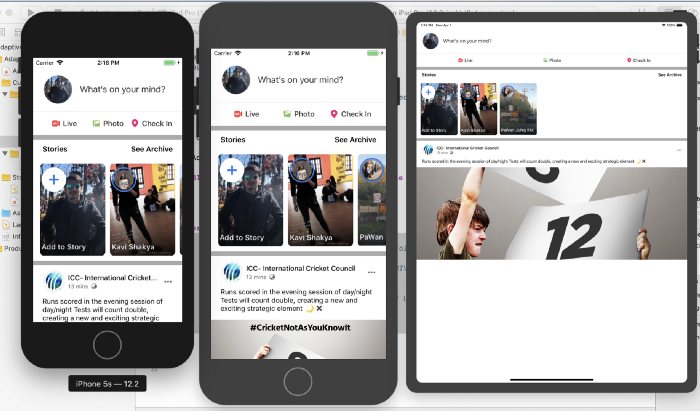
Finding Problems:
Does it look good to you? What are the issues or differences you find on each of the above show devices ?
- iPhone 8 looks better obviously because we designed it for that screen ratio
- iPhone 5S design looks good but in compared to iPhone 8, some of the elements look bigger in this device for example lets take the stories section. Screen size of this iPhone is 320 x 568 and the size of one story view is 140 x 200, which means its occupying approx. 43% of width and 36% of screen height.
- While in iPad pro, the story view looks too tiny. This is definitely not pleasing to user’s eyes, hence not a good UI solution.
- Even fonts in smaller devices (iphone 5S) looks bigger while fonts in bigger devices (ipads and plus devices) looks tiny.
- Same problems we can identify with margins and paddings.
Possible Solutions:
So how do we fix such issues ? There are various techniques to solve this. Apple has its own way of handling this with trait variations. It provides UI behavior variation design options according to device configuration and size classes (Regular and Compact). It requires creating different UI design for different size classes.
We will not be using trait variation today. As discussed earlier, we will use percentage adaptation technique to fit UI according to device size. Open the storyboard and lets again see our view controller. I am sure everybody has defined constraints to all the elements added to view while creating them. Keep this in mind because Layout Constraint will be playing vital role later.
STEP 3: CGFloat Extension to Calculate Relative Value
First of all lets add 2 extension functions to CGFloat that will convert a CGFloat value to corresponding percentage value w.r.t device screen configuration.https://medium.com/media/fd6f92949b5d0fd83baf2ba6f830f57a
As name of the functions suggest these two functions will return relative value of certain number taking the screen size of iPhone 8 (375 x 667) as base model. Basically the logic here is to convert a number into relative value so the formula for certain number say y would be:
— relativeY = y * (current device screen size) / base model screen size
— widthRelativeY = y * (current device screen width) / base model screen width
— heightRelativeY = y * (current device screen height) / base model screen height
Description of some predefined constants:
- upperScaleLimit: CGFloat = 1.8:- Conversion scale limit for large sized elements in larger devices (plus devices and iPads).
- minScalableValue: CGFloat = 8.0 :- All values greater than 8 will undergo upper limit to restrict elements to maximum possible values for that device
These constant values can be changed according to the need of project UI requirements.

