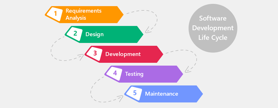
SDLC (Software Development Life Cycle)
19th September 2020
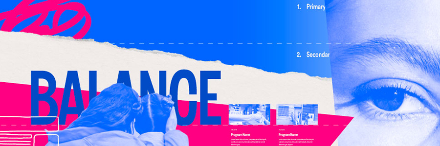
How to Build a Custom CRM Software for Your Business
22nd September 2020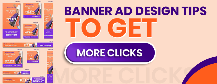
If you’re hoping to boost your online traffic with banner ads, you may be asking yourself: how can I create web banner ad design that people will want to click on? Web banner design focuses on the systematic creation of effective banner ads through the careful application of basic design guidelines. In this article we’ve put together all the information you need to create successful web banner designs.
What is web banner design?
Website design company
Web banner design is among the most prolific forms of marketing used in today’s online world and comes in all shapes and sizes. Web banner design is all about creating the most clickable banner ads possible.
Banner ads are advertisement images embedded on web pages that showcase a product or brand and link to the advertiser’s website. Most companies use them in one form or another because they’re an affordable, measurable and effective medium to increase brand awareness.
- Use the most effective, standard banner sizes
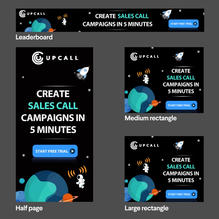
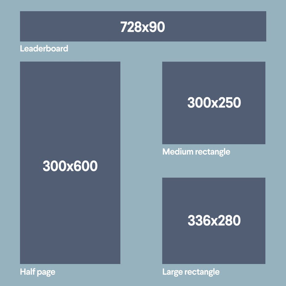
According to Google Adsense, the most successful standard banner sizes are:
728×90px — Leaderboard
300×600px — Half Page
300×250px — Medium Rectangle
336×280px — Large Rectangle
- Place your banner ads correctly
Purchase space on a website where your design will be featured above the fold and close to the main content of a page.
- Keep it simple
Keep content and visuals simple. Viewers are probably only going to glance at your web banner ad for a second.
- Use buttons appropriately
Depending on the type of banner, buttons will often increase the click-through rate (CTR) of your ad. If you’re going to use them, place them after your copy on the lower right side in (tastefully) contrasting colors. Always keep them consistent throughout the set of ads.
- Make your text instantly readable
Do
Make your headline and body copy different sizes. All copy should be four lines or less.

Don’t
Use cursive/script fonts, extremely thin font weight, all uppercase copy, or font sizes smaller than a 10 pt (unless it’s a disclaimer or copyright notice).

- Choose appropriate colors
Every color has a different association, and it’s important to consider what types of emotions you want to evoke in your audience. Color will be the first thing a user notices in your banner ad.
Red: Passion, anger, excitement, and love. This powerful color is attractive to most audiences, but use it in moderation. If you’re aiming for a classic, mature, or serious look, avoid red.
Orange: Playfulness and invigorating feelings. Not as overpowering as red, orange still stands apart from the crowd and exudes energy; it’s a great color for a call to action button.
Yellow: Cheer, sunshine, and friendliness. Yellow is eye-catching and sends out an energy that is youthful and affordable.
Green: Health, freshness, wealth, the environment, growth, nurturing, and new beginnings. It’s easy on the eyes, too.
Blue: Safety, trust, clarity, maturity, serenity, intellect, formality, refreshment, coldness, and masculinity. Blue appears in more than half of all logos.
Purple: Luxury, royalty, extravagance, wisdom, magic, femininity, and creativity. It has a soothing, calming effect on a viewer.
Pink: Love, sweetness, femininity, youth, and babies. Pink is typically associated with all things feminine, but has a real range based on brightness and tone.