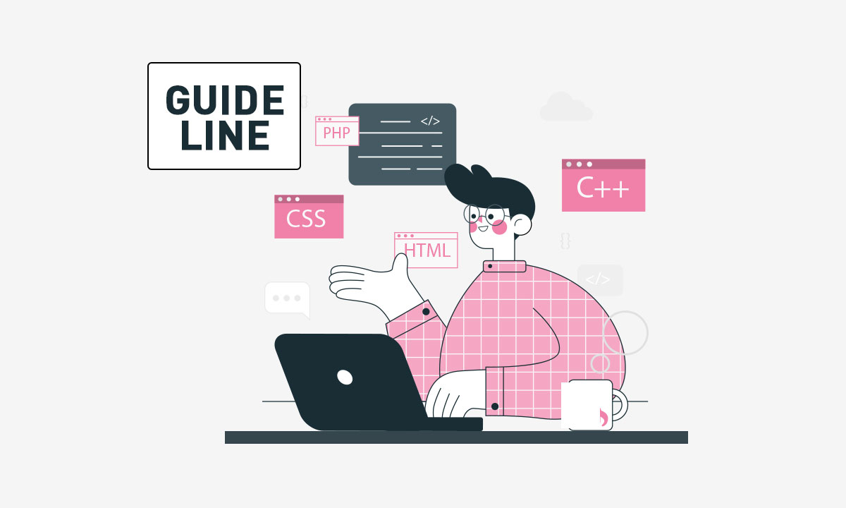
A COMPREHENSIVE GUIDE ON SOFTWARE DEVELOPMENT (VERSION 2021)
26th November 2020
WOOCOMMERCE VS. SHOPIFY VS. MAGENTO- WHICH ONE TO CHOOSE?
26th November 2020
Typography is the foundation of good design and using different fonts is a wonderful way to make your blog or website more unique. But figuring out which fonts to use and combine is tricky.
FONT CATEGORIES
First things first. Let’s identify the different font categories because these are important distinctions to make as you’ll soon see. There are several types of font categories: Serif, Sans Serif, Slab Serif, Monospaced, Script and Display.
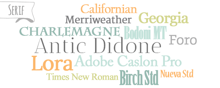
Serif fonts have serifs, little extenders or “feet” sticking off the edge of each stroke. Serif fonts are almost always used in print and have a traditional feel to them.
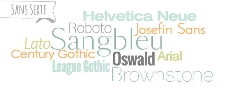
Sans (meaning without) Serif fonts literally do not have the little feet or extenders. Sans serif fonts are common on the web and they feel more contemporary than serifs.

Slab Serif fonts have extenders, but they have thick, square-ending strokes. Many slab serif fonts were created by adding slab serifs to the ends of sans serif fonts. They kind of fit between Serif and San Serif fonts because they have a little bit of modern mixed in with traditional.
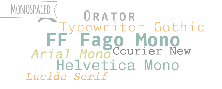
Monospaced font characters each take up the same amount of horizontal space. You may notice that in other fonts, letters like “m” take up more width than letters like “i.” Monospaced fonts are meant to imitate old typewriters or old terminal computers. They are not advised for body copy on the web because the uneven spacing can create which are gaps that appear to run through paragraphs of text. These gaps can cause weird readability issues. Monospaced fonts can be used in titles, subtitles or blockquotes, or they are typically used to show code examples or provide instructions.
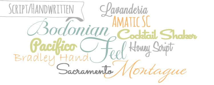
Script or Handwritten fonts evoke handwriting or cursive. Script fonts are intended for decorative use and can add a lot of personality to your design. Use them as an accent, such as in your titles or subtitles, never for body copy as they are not easily read in long paragraphs. Depending on the font, script fonts can have an elegant or casual feel.
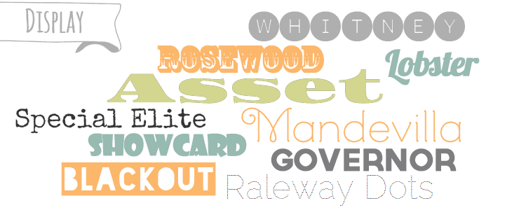
Display fonts can belong to any category above, however they are either quite detailed or very thick and best displayed in larger font sizes. Many of these fonts are popular to display quotes or to put over images. Again, use these as an accent font, such as titles, subtitles, or attention-grabbing text.

Don’t use fonts that are hard to read
You found such a cool font and you love it! But it might be a little hard to read. Think you can still get away with it?
If in doubt, get rid of it! You will do a disservice to your readers if they have to spend extra time trying to decipher what you’ve written. It’s also easier on the eyes to read dark text over a light background as opposed to light text on a dark background.
Above all else, keep your body copy in a modest, easy-to-read font and you won’t go wrong.