WordPress vs Joomla vs Drupal – Which One is Better?
12th March 2021
PHP cURL
12th March 2021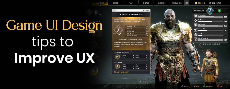
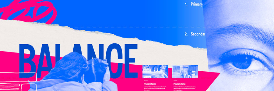
Great design is important and user expectations have never been higher. Use these UI design tips to improve your usability which will lead to increased satisfaction and sales. These tips are general enough to be applied to any digital product.
A fast hook
A fast hook
You have a tiny window of time to immerse the player. Hook the player immediately by engaging them in a great game. Your game should ideally start immediately or be one tap away. Attention is as valuable as gold, don’t squander it!
Keep it light
Be very strict with what you add to your UI, keep it light and simple. Each additional element adds more visual noise, which will add more cognitive load for the user. Your goal should be for the player to consume more of the game, not wade through a swampy UI.
Unless your game is story heavy, keep in mind that the majority will NOT read. Your game should not need a manual for players to understand how to play it. For internationalization, its in your best interest to keep copy to a minimum.
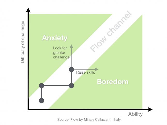
Maintain flow
Keep players enjoying your game longer by maintaining a state of flow. You don’t want to interrupt a good state of flow with an intrusive UI element. The key is to maintain that sweet spot between frustration and boredom. To learn more about this, check out my other article: designing games that flow.
Guide users but don’t be evil
Design is a powerful tool in guiding the user, use it ethically.
We’ve all been tricked into clicking the wrong button – this makes us lose trust in the source. Earn the trust and respect of your players by respecting them. Don’t try to trick your players into buying IAP or clicking on Ads, it might pay off short-term but you’ll lose more in the long-term.
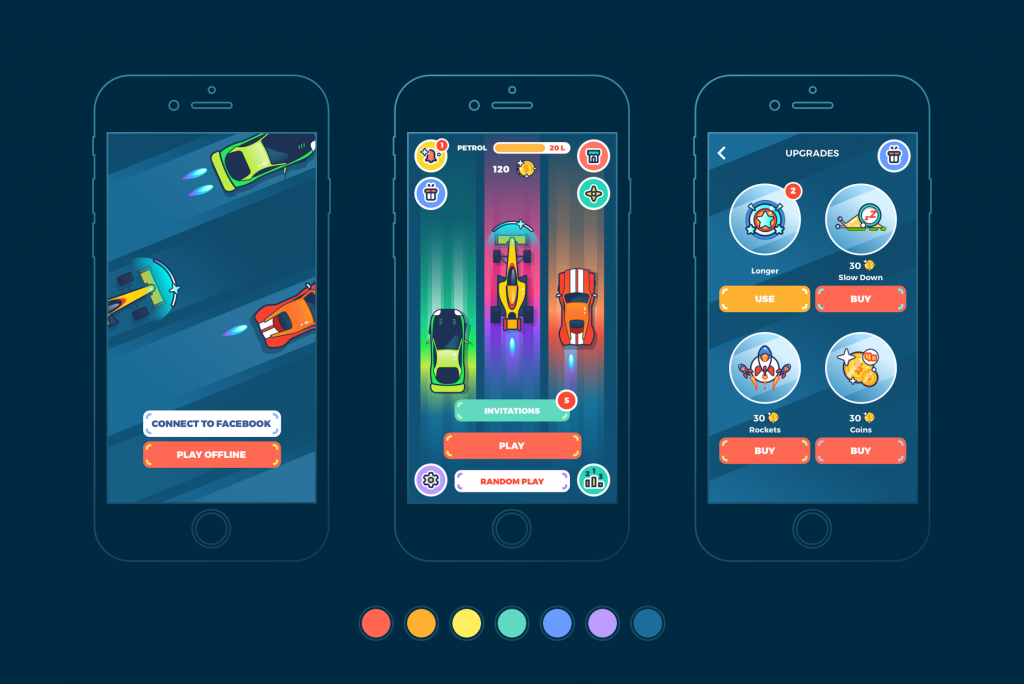
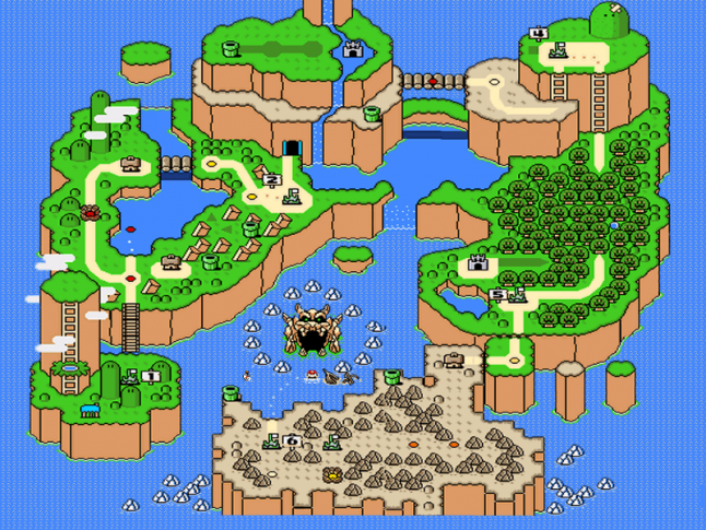
THEME your UI elements
Theme is very important. A UI with a theme that isn’t consistent with the feel of the game creates confusion. Immerse your player in the experience as much as possible, here is a great example – Mario’s level select:
Focus on content
Players don’t want to sit in front of UI’s — they want to be interacting with the bacon of the game. Every time you put a UI element in front of a player you’ve just removed the player from the experience to deal with a boring UI.
Adapt to change
There’s nothing worse than seeing a game with a horrible UI, it detracts from the experience of your game. This happens often when interaction design takes the back seat to other more “important” tasks. When significant changes take place in your game, you’ll find that you will need to iterate on your UI design.
Sketch & Wireframe
This is so critical. Sketching saves you time. Its easier to critique your own designs when they are sketches because you aren’t distracted other factors like colors or buttons. You’re seeking to create a strong foundation from the beginning, a sketch naturally filters out the noise.
If you want your design to be pixel-perfect, mock up your design before starting to code. Iterating while it is in wireframe state is faster than iterating with code. I recommend Sketch. Start with basic shapes and work your way up to a higher fidelity.
Provide hierarchy
The bold titles above are naturally going to be read first, because it attracts your attention. What you don’t want to do is create competition between multiple elements. You want a nice flow that guides the user’s eye to what they should be looking at and in what order.
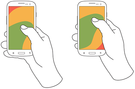
Leverage familiarity
Our game is best played the same way you would hold a game boy. When testing our game, we feel the “one tap culture”. Most people understand the simple tap gesture. When you start using some of the more advanced gestures, you begin to lose users due to confusion.
Use advanced gestures minimally as most people will immediately follow their learned behaviors. Whats the familiar location for a back button on an iPhone? Yes, the top left. Don’t mess with learned conventions, its frustrating.
Get inspired
There’s no harm in getting inspired with what other people are doing. What kinds of apps do you feel are well-designed? Focus on what they’re doing and replicate it if it makes sense for your experience. Find UI design patterns on pttrns or gameinspiration.
Understand the hardware and OS
Buttons on the bottom corners can get covered up when users are holding the iPad. Swipes from the edges of the screen on iOS can unintentionally trigger the control center or notifications. Once we made the mistake of putting our pause button at the bottom corner of the screen, players would unintentionally tap it while playing.
User testing
Without watching users test our game, we would have never noticed some of the mistakes we made. Users are quick to blame themselves when in fact it is usually due to poor design. Test your game often, ask them to play as if they just downloaded it from the AppStore. Watch closely for inefficiencies or hesitations and iterate to refine usability issues.
Maintain flow
Keep players enjoying your game longer by maintaining a state of flow. You don’t want to interrupt a good state of flow with an intrusive UI element. The key is to maintain that sweet spot between frustration and boredom. To learn more about this, check out my other article: designing games that flow.
Create consistency
This one is huge and could be a post in itself. Be consistent with style, navigation, button sizes, etc. This ties into the familiarity point above. Create a design pattern and color palette and stick with it.