


Test cases and Its importance
7th October 2020
Ruby vs Python: Difference Between Ruby and Python
10th October 2020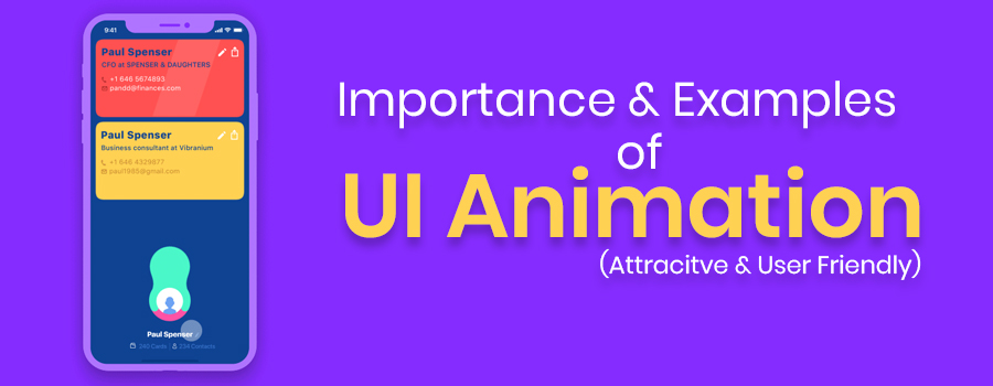
Animation in user interfaces has become very trendy in recent years. A good web/app animation not only attracts far more users, but also provides a much more enjoyable user experience, resulting in higher retention rates.
1. Rate Your Ride
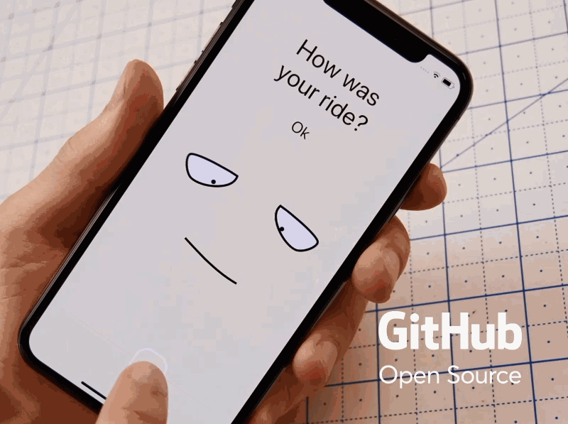
Highlights: Creative emoji animations and interactions
Unlike common mobile apps which uses a table to gather feedback, this ride app uses creative emoji animations and interactions instead.
When you choose different answers for the question “How was your ride?”, the emoji animations will vary correspondingly. The background colors will also change at the same time.
This design cannot only stimulate users’emotions to choose a better answer, and it also impresses users easily, building a brand image in the users’ mind quickly.
The brief-stroke design style also makes the emoji animations more vivid and engaging.
Here’s a tip:
Emoji animations can make your app UIs stand out easily.
2. Order Confirmation
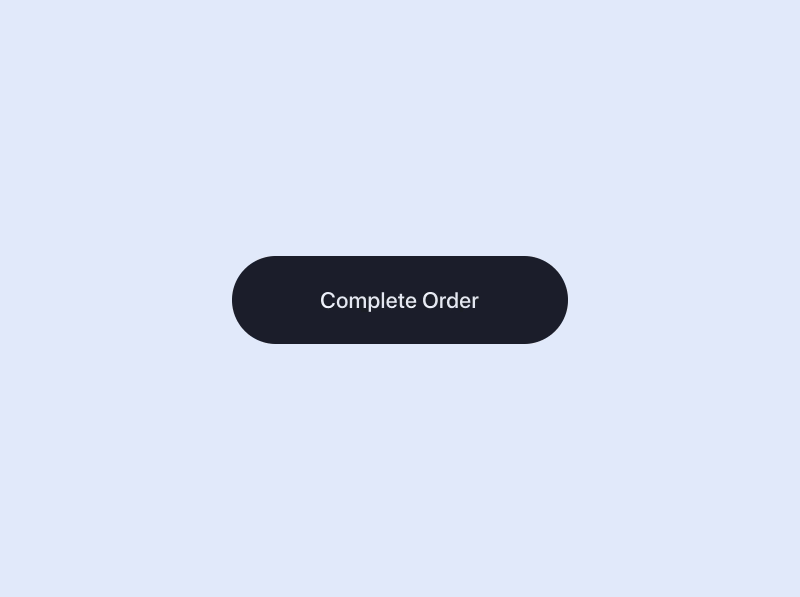
Highlights: Excellent confirmation button animation
This order confirmation button uses vivid animations to give users visual feedback: “Your order has been successfully accepted and confirmed”. In comparison with a static button, such an animated button design enhances the main action of the button and lets users know what’s happening.
Here’s a tip:
Add a vivid button animation to enhance the primary button’s action
3.Smart House Mobile App
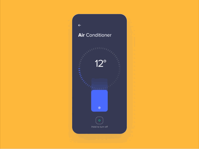
Highlights: Wiping transition effect, icon sidebar
Like the Tesla mobile app UI design, this smart house mobile app animation also uses a wiping transition effect. But, it has a different style which starts from the two sides of the page and ends in the middle. The right sidebar also helps users navigate effectively.
However, in our opinions, to create a more intuitive and “obvious” icon sidebar, it would be great if a text label can be added below the icon to further explain it.
Here’s a tip:
Pair your icon buttons or icon bars with text labels to create more obvious app UIs
4. Shoe Box Swiping
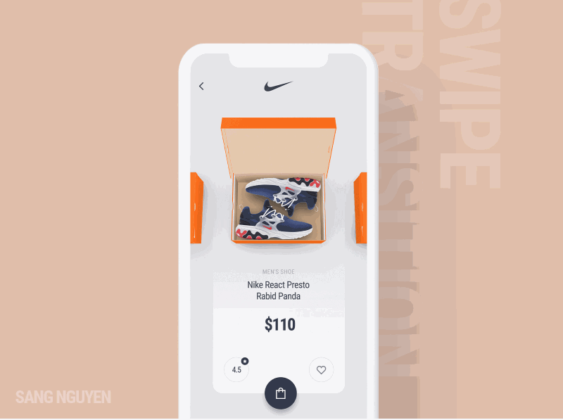
This shoe shopping app uses a swiping transition effect to present the shoe boxes one by one. Users can easily click to choose their desired products and view the product details. This app design is clean, neat and user-friendly.
5.Food Recipe App
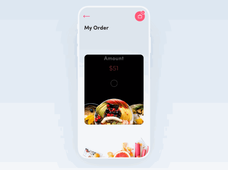
Highlights: Smooth rotating transition effect
This recipe app uses a smooth rotating transition effect to showcase its dishes. The combination of proper text explanation and delicious dish images makes the app eye-catching – and the great user experience helps as well.
This is the perfect model if you are working on a food or recipe app.
