What is a Firewall? The Different Firewall Types & Architectures
21st August 2020
What is Amazon CloudFront?
21st August 2020
What is minimalism?
Actually, minimalism is a word of broad meaning used in various spheres of human activity. Merriam-Webster dictionary defines it as a style or technique (as in music, literature, or design) that is characterized by extreme spareness and simplicity. Being applied to more and more fields, it saves its core traits: meaningful and simple.

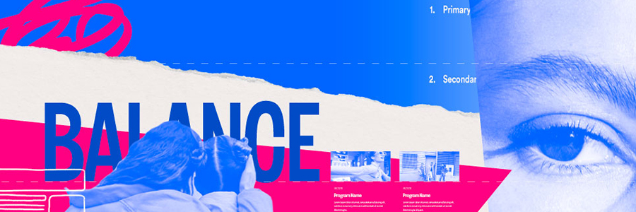
Minimalism as a direction of visual design got especially popular in the 1960s in New York when new and older artists moved toward geometric abstraction in painting and sculpture. The movement found its impression in the artworks associated with Bauhaus, De Stijl, Constructivism and so on. In diverse spheres of visual arts, key principle of minimalism was leaving only essential part of features to focus the recipient’s attention as well as support general elegance. Lines, shapes, dots, colors, spare space, composition — everything should serve its function being thoughtfully organized. Today we can meet minimalism in a variety of life spheres: architecture, arts, photography, all kinds of design, literature, music and even food presentation.
A shape, a volume, a color, a surface is something itself. It shouldn’t be concealed as part of a fairly different whole. Working in this style, designers seek to make the interfaces simple but not empty, stylish but not overloaded. They tend to use negative space, bold color and font combinations, and multifunctional details making the simplicity elegant.
Characteristics of minimalism
Main features of minimalism often mentioned by designers include:
- Simplicity
- Clarity
- Expressive visual hierarchy
- High attention to proportions and composition
- Functionality of every element
- Big amount of spare space
- High attention ratio to core details
- Typography as a significant design element
- Eliminating non-functional decorative elements
Flat design
The most prominent feature of this direction is applying flat 2-dimensional visual details as the opposite to highly realistic and detailed skeuomorphic images. Flat images usually use fewer elements and curves, avoid highlights, shadows, gradients, or textures. This approach allows creating images, buttons, icons and illustrations which look neat in different resolutions and sizes. It lets designers enhance usability and visual harmony of user interfaces.
However, the terms «flat» and «minimalist» shouldn’t replace each other which often happens today. They are not the same. «Flat» deals with the style of icons, illustration, buttons and other visual elements of the interface in the aspect of gradients, textures, shadows etc. «Minimalist» has much broader meaning and deals with the layout in general, its composition, color palette, contrast and all the techniques of visual performance applied to it. So, flat can be described as one of the design techniques applied in the minimalist approach to creating interfaces.
Monochrome or limited color palette
Color is a feature of a great potential in design of interfaces as it can set both informative and emotional links between the product and the user. Designers working in minimalism tend to take the maximum from color choices, and in most cases, they limit color palette to monochrome or minimal set of colors. This strengthens the chosen colors and doesn’t distract users with too much variety. Such an approach is efficient in interfaces concentrating users’ attention on particular actions like buying, subscribing, donating, starting to use etc. Moreover, in the psychological perspective, the colors usually transfer particular associations and emotions perceived by users, so limited palette makes chosen colors stronger in this aspect.
Bold and expressive typography
Typography in minimalistic design is seen as one of the core visual elements of not only informing users about the content but also setting the style and enhancing visual performance. Choosing the way of concise use for graphics, designers usually pay much attention to the choice of typography and never hurry in testing the pairs, sizesand combinations. As well as color, fonts and typefaces are seen as a strong graphic element contributing into general elegance and the emotional message it sends. On the other hand, readability and legibility do not lose their leading positions in the matter of choice.
Choice limitation
One of the strong sides of minimalism in interfaces is enhanced user concentration. Being focused on functionality and simplicity, the pages and screens of this kind don’t usually overload users attention with decorative elements, shades, colors, details, motion, so in this way, they support high attention ratio and often let users quickly solve their problems and navigate through the website or app.
Prominent theme visual elements
Working on minimalist UI, designers do not apply many images, but those which are chosen to be used are really prominent, catchy and informative. This approach results in the long and thorough search of the «right» image which would cover all those functions and set the required mood instantly. The photo or illustration itself has to follow the principles of minimalism, otherwise, the choice of the wrong image can ruin all the layout integrity.
Adding air and using negative space
White space (also called negative) in digital design is the term which is more about space rather than color. In minimalism, it is one more effective way of adding elegance and marking out the core elements. Also, in terms of monochromatic or limited color palette, white or negative space plays the big role in creating enough contrast and supporting legibility.