


Make your app faster with PHP 8.3
13th February 2024What Is Cassandra? Meaning, Working, Features, and Uses
29th February 2024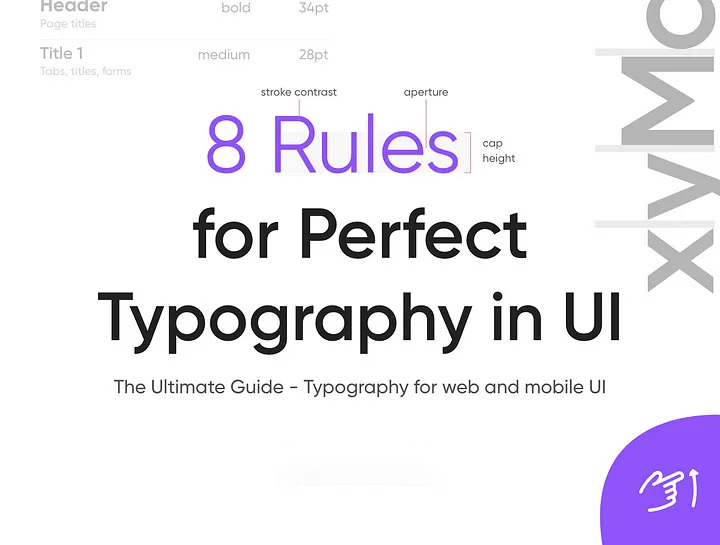
A study shows that 70 % of User Interfaces depend on typography as it is the best source of communicating with anyone.
Typography plays an important role in User Interface, and improving your typographic design is an important step in improving both UI and UX.
Designing a user interface differs from designing an ebook or blog theme, although the principles of type-centric design still apply technology has evolved a lot, so here are 8 rules for better typography in UI.
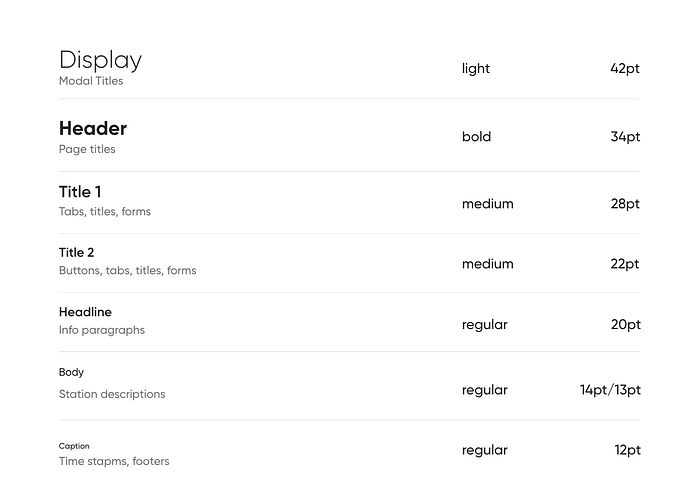
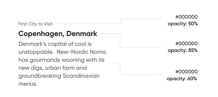
1. Hierarchy
One of the most important techniques for effectively communicating content is the use of a typographic hierarchy.

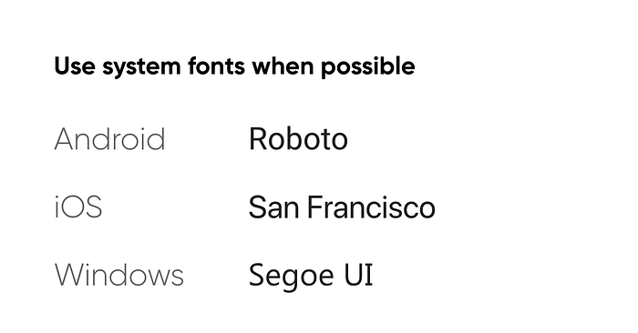
2. Font Choices
Choose from well-known sources, Sans-Serif or Serif are safe choices.
Choose a typeface that works well in various sizes.
3. Text sizing
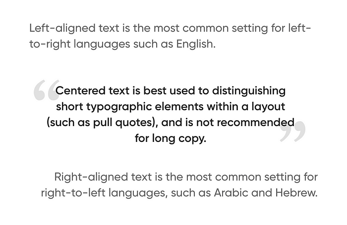
4. Text Aligned
5. Line Spacing
Line spacing is the vertical distance between lines of text.
- Aim for about 140%-180% for optimal readability and accessibility.
- Limit line length to 70–80 characters.
- Font size should be a minimum of 16pt. The bigger the screen the bigger the text.
- Small fonts need more spacing.
6. Letter Spacing
- Larger type sizes, such as headlines, use tighter letter spacing to improve readability and reduce space between letters.

- For smaller type sizes, looser letter spacing can improve readability

7. Color & Contrast
Consider making the body text on-screen dark gray rather than black. Screens have more severe contrast than paper and thus are more tiring to read at full contrast.
8. White Space
White space, also known as negative space, is the area between elements in a design composition. In case the white space is not balanced, a copy will be hard to read.
For More Info: xpertlab.com
Related Blog: Fundamentals Of Typography For UI Design

