What is a Game Server and How Does it Work?
22nd December 2022
How To Manage Time?
28th December 2022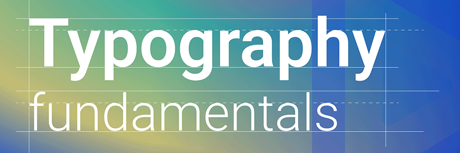
UI UX Company uses User Interface designs that will not be meaningful without good typography. Therefore, using typography is a critical aspect of User Interface design, especially in a design with text. In addition, typefaces give a message to users of the design. Therefore, User Interface designers make many decisions about using a typeface, including the kind of font, body text, size, and placement. Furthermore, as you will be using text content for your designs, it is essential to make this text content attractive and easy to read.
In this article, you will grasp typography, its importance, and how to have good typography in our User Interface designs.
What is Typography?
Typography is the art of arranging texts in different font combinations, sizes, and spacing combinations, to make them legible and pleasing to the readers. Typography is what gives life to texts.
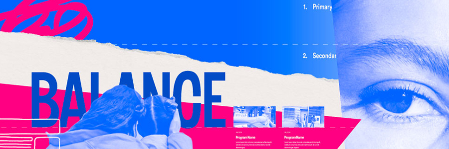
Why is typography important in UI designs? Typography goes way beyond the ability to choose beautiful fonts; it is an essential element in user interface design. Good typography can do so many beautiful things in your designs, so it is necessary to look at its importance.
- Branding: Typography makes the identity of a product stand out. To create compelling visuals for users, UI designers use typography, which gives recognition to a particular product. In addition, the arrangements of the text make the product’s design unforgettable, making it easier for the users to link the typeface on your site with your brand.
- Creating content: To modify text in a design, the UI designers use typography. Different typefaces are available, and the designers create beautiful designs that captivate the users.
- Draws attention: Good typography can enable someone to stay longer on your site because you will be able to focus on the right things.
- Attractive designs: A perfect combination of the correct fonts, text size, and colours makes designs catch the eye. This helps in producing good typography for viewers.
Type Families
Type families are varieties of related typeface designs with similar design features and functions. There are several families of typefaces, and they are classified based on their style. The two major categories of typefaces are:
- Serif typeface: Just as the name implies, Serif typefaces consist of serifs, which are slight projections or extensions ending off a letter’s stroke in a typeface. These typefaces attract attention due to their appearance. Some commonly used serif typefaces include Garamond, Times New Roman, Bodoni, Georgia, Baskerville, Rockwell, and Courier New.
- Sans-serif: These typefaces do not have the projections that are familiar with Serif typefaces. They take lesser space for the same pixel of Serif types as they do not have extensions. They are much more eligible and smaller in size also. Examples include Helvetica, Gill sans, Roboto, Arial, Calibri, Futura, and Tahoma.
Elements of Typography
Several terms designers use to hint at designing needs and requirements are known as typography elements. Eight essential typography elements include typeface, hierarchy, contrast, consistency, hierarchy alignment, white space, and colour.
Typefaces: A typeface is not precisely the same as a font, although people use them interchangeably. A typeface is a design feature for characters and letters of different sizes and weights. Simply put, a typeface is a family of related fonts. All typefaces contain different font sizes. Typefaces are classified based on their styles, and some of the common types include Garamond, Bodoni, Times New Roman, Rockwell, Helvetica, Tahoma, Roboto, and Gill sans. On the other hand, a font is a graphical representation of a text character. Fonts are variations in a typeface’s weights, styles, and sizes. The variations include when a typeface is bold, roman, italic, or any other form.
- Hierarchy: Typographical hierarchy seeks to ensure a clear difference in the texts of a design by creating a distinction in the heading, subheadings, and body of texts to make the part the essential part seen clearly.
- Contrast: Similar to hierarchy, contrast emphasizes the message you want to pass on to the readers. In creating contrast in UI designs, designers play around with the design characters’, typefaces, colours, and sizes.
- Alignment: Alignment tends to unify design elements by ensuring they have equal size, space, and distance. For example, this is why UI designers build margins that align their logos, headers, and body of text.
- Colour: Colors make texts stand out. A designer must know how to make texts attractive and legible, even for the visually impaired.
- Size: This involves adjustment of the size and spaces of text to fit in with the design.
- Consistency: This element helps organize the design interface, and the readers notice a pattern.
- Whitespace: Whitespace is the space around design elements such as text, margins, or graphics. Proper arrangement of this space helps make the design pleasing and in order.
Rules of Thumb in Typography for Designs
Some basic rules will quickly and simply make your designs better.
- Ensure that the typography of your design mirrors the personality of the brand you are designing.
- Create a big difference when you want to create contrast when you have two elements, for example, a header and body of text.
- Choose a suitable typeface and font for your designs.
- Use similar font when designing for the same brand.
- It is preferable to stick to the two types of families, the Serif or Sans-serif, to create contrast, except you are intentionally trying to make your design look messy.
- It is better to pair a regular and an italic font to make emphasis.
- Ensure that your header is two times bigger than the body of the text.
- Creating the proper contrast between the typeface and background colours is vital.
- Do not download more character sets of a font when downloading a web font to avoid unnecessary weight.
- To be able to create a big contrast, try pairing fonts that have different weights.
- Endeavour to use the same icon and font when designing to maintain consistency.
- It is better to pair a regular and an italic font to make emphasis.
- Above all, ensure you consider all the elements of typography when designing.
Creating Contrast with Type
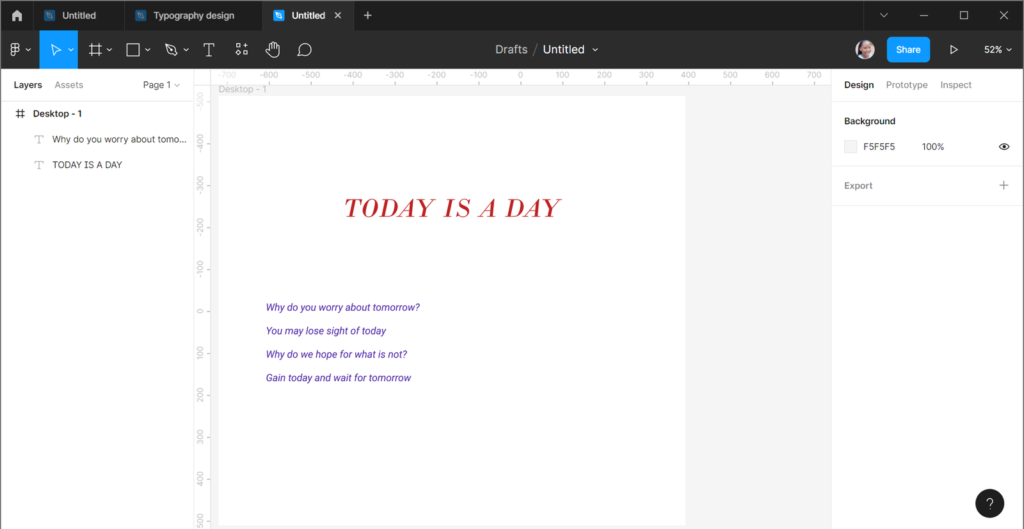
Creating contrast with type is essential in web or app designing. There are several ways one can develop contrasts with type, including changing the font styles of a design. When designing, you can create contrast using several font styles like italic, small caps, or condensed. For example, the design below shows the heading in big caps and italics while the content is in italics. The style you choose depends on the kind of contrast you want to create.
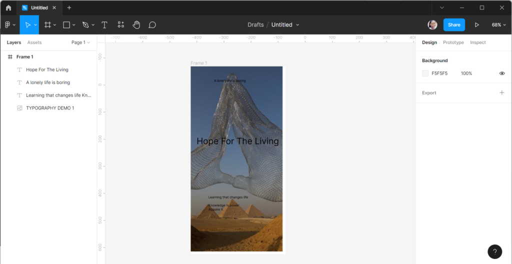
Changing the sizes of types in a design can help create contrast, and viewers tend to focus on the area with contrasting characters. For example, the texts at the top and bottom of the design are 12px and not so clear, but the text at the centre is clear to read because the size is 32px.
Building Your Type Library for Your Designs
As a designer, you can access many fonts you use in designing. However, sticking to what you know through the file font will not be enough, and your designs will start to look the same. Having many fonts in your library will be great, and this is how you can build your library.
- You must know how to develop your eyes in font relationships.
- Get to know several fonts.
- You can start by searching for the 15 best google fonts.
- You can also check for some popular fonts.
- Have an excel font file where you store your fonts.
- Any font you use for a design, ensure to save it on your excel font file so you can quickly go to it when next you need to make a selection.
You can use this format to build your library and create the excel file of any font you use in your designs.
Similar Blog: