How To Incorporate A Flexible Work Week Without Losing Productivity
8th November 2022
AWS AppSync
15th November 2022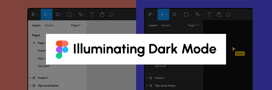
Over the last couple of years, one feature emerged as our top user request: dark mode. Designers were tired of being assailed with a bright screen when working on Figma files late into the night, and studies have shown that people with visual impairments find dark mode more legible than light mode. (Visual contrasts are a core tenet of the W3C Accessibility Guidelines [WCAG] 3.0 standards, and we wanted to make sure our dark mode efforts satisfied those requirements.) That meant that delivering dark mode for us was more than just answering a user request—it mapped back to Figma’s core mission of making design accessible to all.
So, after months of toiling over the right approach, we shipped dark mode in May. Product Manager Jacob Miller and Product Designer Ryhan Hassan detailed the product and design challenges of implementing dark mode at Config 2022, our annual conference. Not only did dark mode surface thorny UI questions—which Jacob and Ryhan talked all about—it required a significant engineering lift. As they said in their talk, “One of the hardest things about the dark mode is that people think it’s easy.”
The complexities of colour
On the surface, implementing dark mode seemed like a straightforward front-end change: Simply swap every light colour for a dark one. But we quickly discovered that the project was much more complex than that. We wanted to build a solution that wouldn’t just solve the existing need for a new feature, but would be flexible enough to scale with us as the product evolved. Doing so would make it easier to onboard new engineers, tackle unforeseen challenges, and introduce new themes down the road. The trick was developing an approach that would be easy to implement and maintain, while also ensuring that it was regression-proof. In other words, we didn’t want to break things across the app while trying to experiment with different solutions.
These considerations informed two main goals for the workstream: Enable Figmates to design and develop new features in dark mode out of the box and make it easy to introduce new themes to Figma and FIGJAM. And, we wanted to do both while building for the future state of Figma.
Understanding the challenges
As the engineering lead for dark mode, I wrestled with which challenges to tackle first: those specific to the UI, and those pertaining to the scope of the entire project. Before we even thought about writing a line of code, each team member audited the surfaces in the Figma app to see how difficult it would be to recreate those pieces in dark mode.
Some UI decisions were straightforward. For example, we immediately knew we wanted the light panels in the editor to become dark in dark mode, with light icons and text as foreground elements. We also decided that we needed toolbars and menus that were already dark in light mode to stay dark.
There were also many product considerations, from which parts of Figma should support dark mode, to how dark mode would impact the core UI. Jacob puzzled over whether we should constrain our project to solely focus on the Figma editor, where designers spend the majority of their days; we thought about whether it made sense to shift user-generated canvas content, such as the canvas background when users switched themes; we wondered whether colours rendered by our C++ engine that powers the editor, such as the canvas transparency grid, would need to shift.
Defining the schema
As we dove into the project, the biggest challenge was creating a set of variables to re-theme the Figma app in dark mode. Since every light colour doesn’t exactly map to a dark one, and vice versa, we had to differentiate in code between surfaces that shift between light and dark depending on the theme (e.g. side panels in the editor), versus those that always remained dark (e.g. toolbars and menus).
Our challenge with semantic tokens lay in defining a naming schema that made sense for Figma. The naming had to satisfy some requirements:
- Define a minimal but sufficient set of token variables. This set of variables is needed to describe the various colour use cases in our app. For example, because menus and toolbars are always dark in Figma regardless of theme, but panels change colours depending on mode, the colours used by each of these surfaces had to use different semantic tokens. If there were too many, the process of choosing a token would get overwhelming and inconsistent. Too few, and engineers and designers would likely require us to add more tokens over time to satisfy their use cases.
- Follow a predictable naming structure. A clear naming schema would help engineers and designers choose a token to apply when building a design in Figma or in code.
- Use distinct tokens for background and foreground elements. This helps us update all icon or text colours at once, for instance, if we wanted to improve the colour contrast of our app.
- Allow complex inheritance structures for tokens. For example, if we wanted more specific versions of a token to point to the same value as the default version of that token, we could specify that.
Dark Mode Week
We decided to divide and conquer, asking engineers from each product engineering team to contribute to the initiative. Once we had a systematic way of defining colours for Figma’s web surfaces and understood the end state we needed the app to be in, we wanted to see how much progress we could make towards our goal in a week. Dark Mode Week was born.
This approach allowed us to spread the refactoring cost, making it more efficient. What might have taken a small group of engineers months to complete ended up taking forty engineers a single week. In fact, by the end of Dark Mode Week, we estimated our progress at 80% of surfaces that were in scope for the project!
Related Blog https://xpertlab.com/game-ui-design-tips-to-improve-ux/