

Grape
1 February 2024
N-Power Global
1 February 2024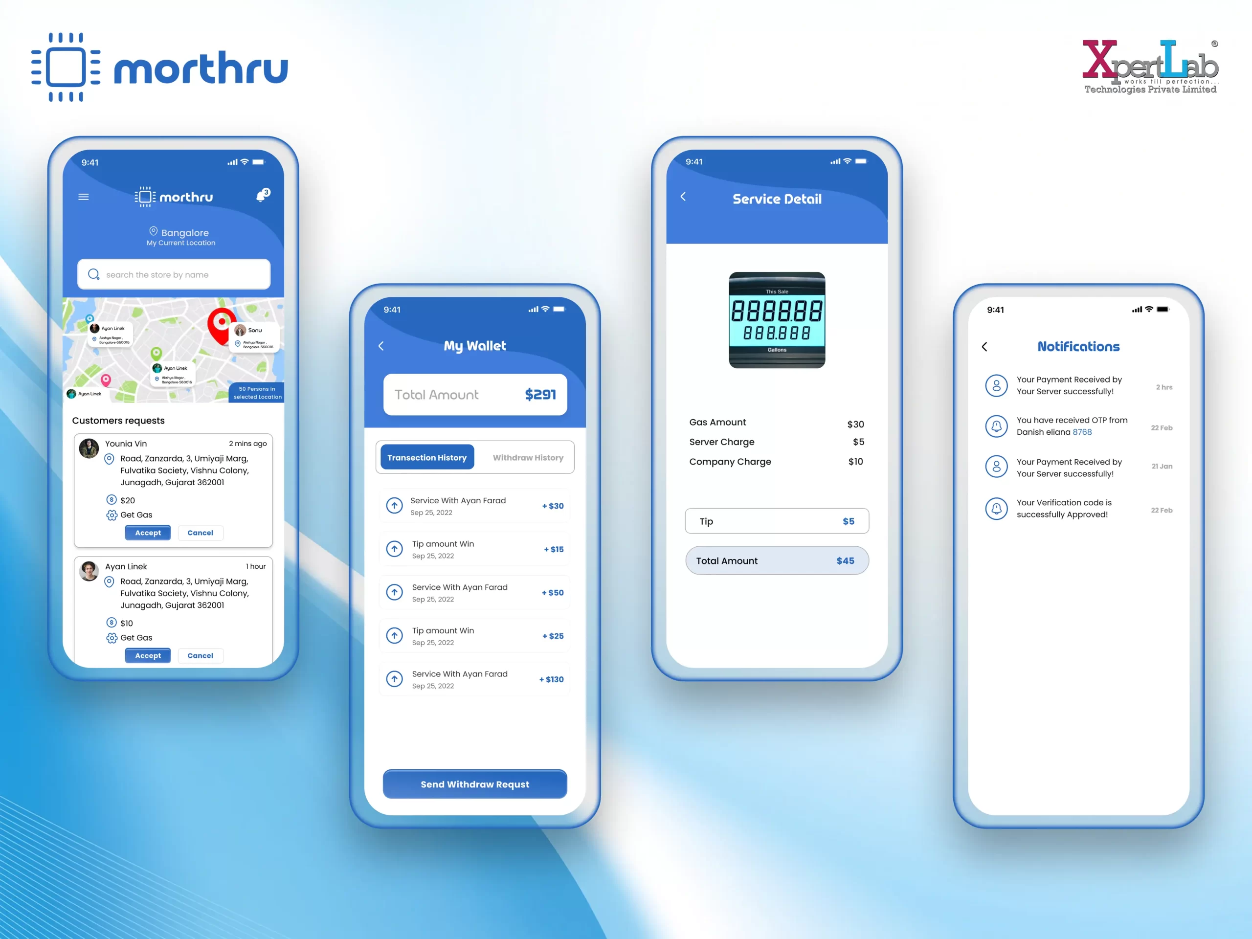
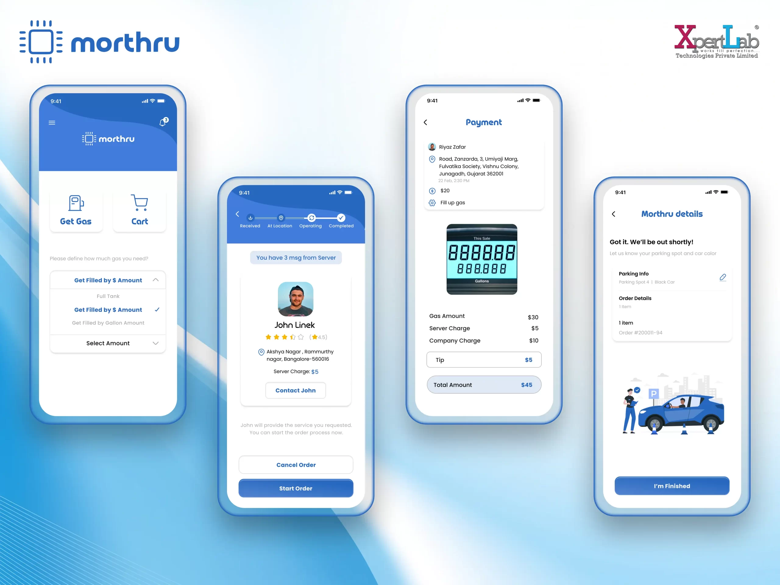
The Morthru UI UX Design is a UI/UX design project crafted by XpertLab that shapes a modern, coherent interface for the Morthru brand.
The design gives Morthru a confident visual identity built on clear layouts and a consistent component system. Thoughtful navigation and balanced typography make the experience feel polished and easy to use on any screen.
Key features of the Morthru UI UX Design
- Modern, distinctive brand interface
- Clear, balanced page layouts
- Consistent visual and component system
- Intuitive navigation throughout
- Readable typography and spacing
- Mobile-friendly, responsive screens
The Morthru UI UX Design was crafted using modern design tools with reusable components and interactive prototypes for a consistent experience.
Every screen is planned around real user goals, so people reach what they need with the fewest possible taps. Consistent spacing, colour and typography give the interface a professional, trustworthy feel, while accessible contrast and clear labels keep the whole experience comfortable and easy to follow for users of any age.
By establishing a clear visual system, the Morthru UI UX Design helps the brand feel trustworthy and modern. The Morthru UI UX Design was built by XpertLab Technologies Private Limited, and its approach follows the practices documented at Figma to keep quality high.
From the first planning session to final delivery, the team focused on the details that matter most — performance, security and a smooth, dependable experience — and tested everything carefully before launch. The result is a solution the client can trust today and continue to grow with over time.
Overall, the Morthru UI UX Design delivers a polished, cohesive interface for the brand.